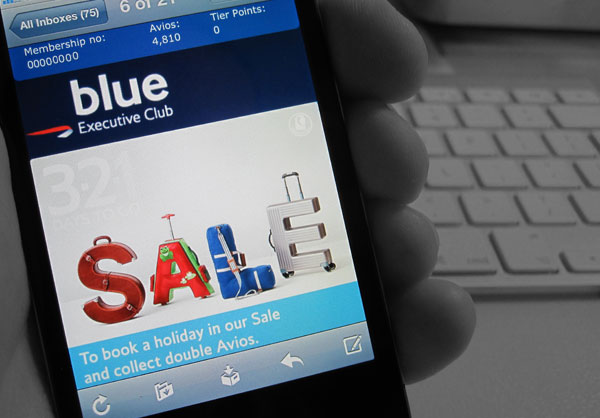
Rethinking Mobile Email Design

The shift to mobile represents a huge challenge to email design. We know that more and more users are checking emails on smart phones and tablets, but currently our approach has largely been to make our current designs work as best we can for these users.
In the past we’ve sectioned off people who check their email on mobile devices, and treated them differently, sending them their own special, slimmed down HTML. We can’t do that any more. Users flip between mobiles, desktops and tablets, checking the same email account on each device, so we need to make campaigns that work well for every platform.
If we’re going to do it right, we need to do more than just make a token effort – we need to rethink the way we approach email design.
Looking to the web
There are two approaches currently being used on the web that help create platform agnostic pages, and we can learn from these when creating similar email campaigns:
Mobile First
You may already have read Luke Wroblewski’s compelling arguments for designing first for the mobile, then for the desktop. If not – then read up here, and ideally pick up the excellent A Book Apart book here. The most interesting argument here is that mobile forces you to focus. If you design and write first for the constraints of mobile, you’ll find a campaign that works there will also work on larger platforms. Then we can add an extra layer that enhances the experience for tablet and desktop users.
Responsive Design
Responsive Design is an approach used on the web to create websites that adapt their layout and design for the viewing device. It’s not creating a separate mobile version, it’s making one piece of HTML that adapts for multiple platforms.
We’ll look at how to code responsive emails soon, but until then lets look at the considerations to make a campaign that works for mobile devices.
Designing for all platforms
Make the message clear
Make your message succinct, clear and easy to action, and it’ll work both on mobiles and desktops. In the past we’ve seen plenty of desktop campaigns packed full with long form copy. We need to cut out the waffle, and make it easy and quick to read.
It’s possible with CSS to remove some of your desktop content on a mobile device, but we should only be using this for tweaking design elements, not editing the message. If you can’t get your message across in a 320px wide mobile device, it’s hard to see how adding loads of extra content for desktop users will solve this.
Design for a touch screen
The majority of smart phones are touch screen, and therefore users are selecting links using their fingers and not a mouse. Having measured a vast array of thumbs and fingers, Apple’s human interface guidelines state that the minimum size for a click-able area should be 22x44px. This means you should make (at least) the main call to action links nice and large, and easy to select on a touchscreen. You should also ensure that links are spaced out so they aren’t mis-tapped – a minimum of 22px again is advisable.
Remember that whilst you may or may not consider the iPad a mobile device, it does still have a touch screen.
Design for the screen size
The portrait iPhone screen size is 320 pixels wide, whilst most desktop emails are currently 600 to 700px. We want something that works in both – so if you don’t go down the responsive route, this means shrinking the amount of copy, then making the text size larger. iPhones will automatically resize body copy so it’s legible, so that already helps, but you need to make sure that the larger text doesn’t then break your design (this often happens on buttons and nav menus).
A simple way to consider small-screen design is to make your design one column, with full width images. This will automatically shrink down pretty well, and minimizes any issues from text being resized. This campaign from Solo is a good example.
At the very least, we should ensure that text and call to action buttons are legible on the small screen.
Don’t make mobile assumptions
It’s easy to assume that because people are using a small screen device, they’re on the move. All we can really tell is their screen size, so they’re just as likely to be sitting on their sofa. Whilst we have the technology to detect a device and it’s screen size, we should avoid explicitly changing the content to be “mobile specific”.
Think about the customer journey
It’s important to get the email right, as it’s often the first step in a longer journey, but we also need to think about where the user goes next. Once they’ve clicked on from the email, is the landing page optimised for smaller screens? is it easy or even appropriate for your users to convert via a mobile handset? that’s perhaps phase two, but it’s something that needs considering.
And finally..
Rule #4080
Don’t use QR codes. ever.
-
Josh Green
-
Renato Gelforte
-
http://www.elliot-ross.co.uk/ Elliot Ross
-
Renato Gelforte
-
-
-
http://www.facebook.com/joeydavis Joey Davis
-
http://www.elliot-ross.co.uk/ Elliot Ross
-
Vik
-
http://www.elliot-ross.co.uk/ Elliot Ross
-
-
-
-
Jean Butterfield
-
http://www.elliot-ross.co.uk/ Elliot Ross
-