The Click Generation

Call to actions are the key to any email campaign, these little beauties help your user decide on where and what to click – not that they always do as they are told. There are many different varieties of CTA’s and the impact of using the right one can be colossal (we’ve all heard the story). So what makes us so inclined to click or tap one CTA and not another?
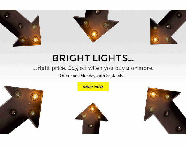
You have to admit, there is definately something about wanting to click inside a bright coloured rectangle…
Since day dot.com
If you have children, or maybe you used to be one yourself, then you are most likely aware of the obsession they seem to have with buttons. Racing their siblings to the pedestrian crossing, playing with toy phones, remotes, doorbells, keyboards, fusing the house by flicking light switches or resetting the wireless (oh, the frustration); I think you get the picture, kids love buttons. So has this always been an indication of what is to come in adulthood? We need a good ol’ button to lure us in to ‘learning more’ or ‘buying now’ when we can already assume clicking on the image or title will have the same outcome? Is it just that it’s more attractive to our inner kid? David McRaney published a brilliant article (quite some time ago, admittedly) on the psychology of buttons and this is what heightened my curiosity on the subject.
Your whole life, you’ve pressed buttons and been rewarded. It’s conditioning at its simplest – just like a rat pressing a lever to get a pellet of food. – David McRaney
Design Dampener?
It seems we have been drawn to buttons our whole lives, so why would we stop now? On reflection, marketers are smart to include these big shiny buttons to get us through to their site; but with marketing emails becoming more and more simplistic, digestible and image based, a bulky button on it’s own on a page can look out of place and isn’t always design-convenient. Most users who are familiar with the internet and interact with brand emails regularly, will know or learn quickly that if you click almost anywhere, in the body image of the email, you will achieve the same action as the main CTA (like below). So for these users, if they want to click, they will click; big flashy button or not.
NB: It is also important to take into consideration that if images are off and you have a CTA on the image – chances are your users are less likely to click through. The ALT text can help you out but it might not have the same impact. Jason Rodriquez over at Litmus recommends bullet proof buttons -> View article here.
Who’s your audience?
In a great post last week, Tony Gines made a good point, that users (like your mother) who aren’t as experienced with the web or aren’t classed as ‘power users’, may need a bit more direction. This is another good example of where big flashy CTA’s work well. They may not know that a change in cursor means you can click on a link or object, or that ‘buy now’ doesn’t mean you are automatically committed to that purchase (unless you’re Amazon). Designing for your audience is key, so make sure you think about the profile of your subscribers first, but you know that already.
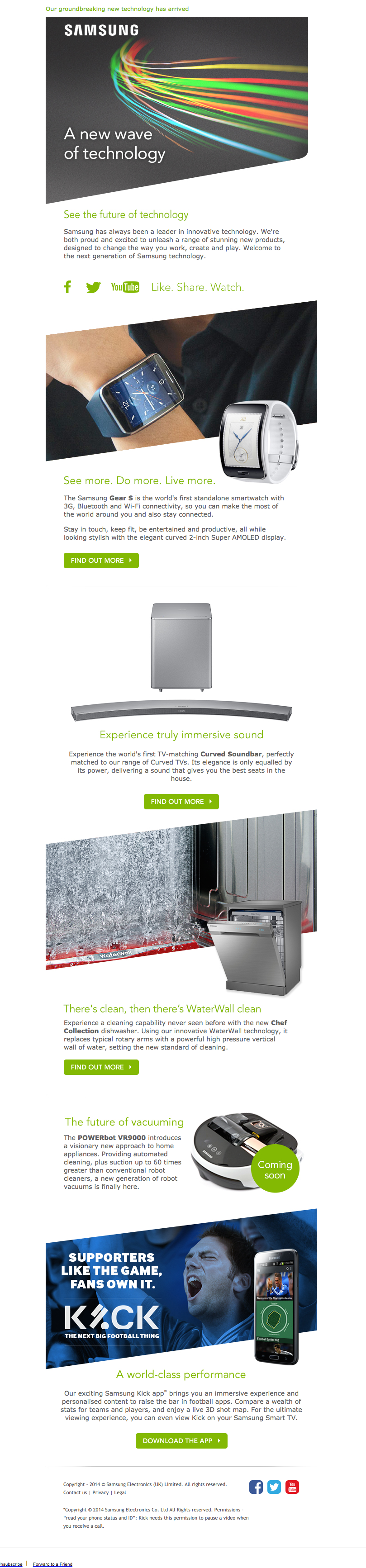
Samsung’s recent design is a good example of how to keep a campaign looking modern whilst still navigating the customer through their content with clear CTA’s. For an email with quite a bit of text and a few products, it looks pretty good ‘eh?
I’m not suggesting that everyone in certain demographics struggle with clicking on an email and need massive bright buttons to be able to click through, but if designing an email in favour of navigation over aesthetics will suit your subscribers more, do it – and vice versa. These may be ‘placebo’ buttons but once people know where to click, they will carry on doing so in future.
As long as you get the result you were looking for after you press the button, it doesn’t matter. You will be more likely to press the button in the future (or less likely to stop). – David McRaney
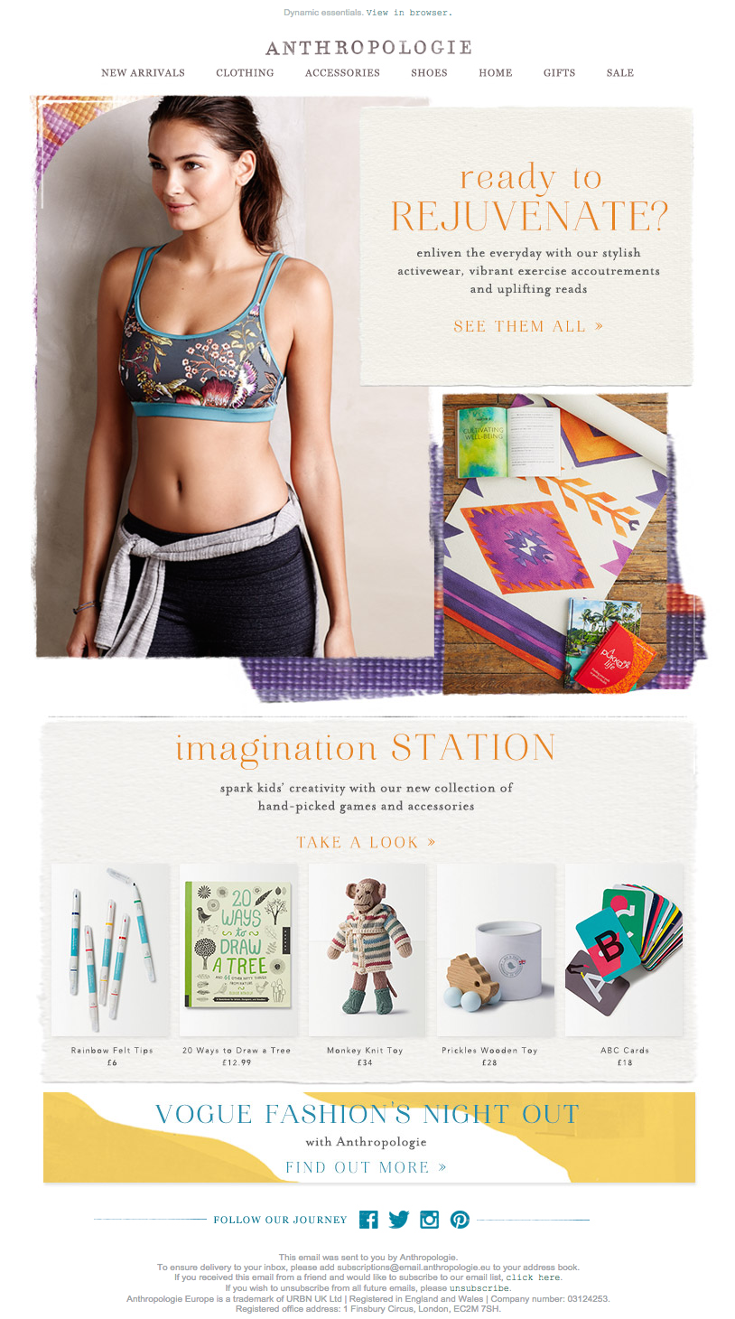
And it goes without saying that it would also make sense to keep your CTA’s consistent so your regular users know to look for them. So although it might seem old fashioned to use a rectangle of luminous colour to attract your subscribers, don’t be afraid. These will be sticking around for a while. Your customers like familiarity and security, whether it’s text on an image like Anthropologie or a traditional button like Samsung. With today’s analytical tools, it is easy to test and see what suits your subscribers best and those preferences still may change over time.
Brain dump over. If you have any interesting experiences to share, I’d love to hear them. What are your personal habits when clicking through from an email campaign?