Top Emails For May
Our top emails for May have inspired us to get creative! Making us want to redecorate our homes, dig out the fairy lights, and make DIY duvet forts 🏠 ✨.
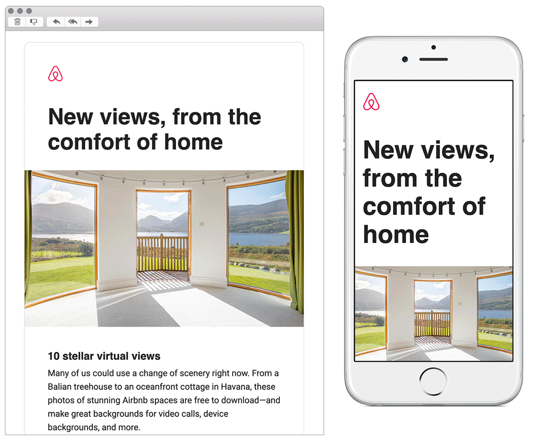
1. Airbnb
SL: Stunning Airbnb scenes for your virtual background
Chosen for:
- Content. With holidays and plans cancelled, Airbnb have continued to nurture their email subscribers with some great content. Jumping on the video call background trend, they have created an array of downloadable backgrounds. This was a great opportunity for Airbnb to highlight some of their best locations, and the chosen photographs do just that!
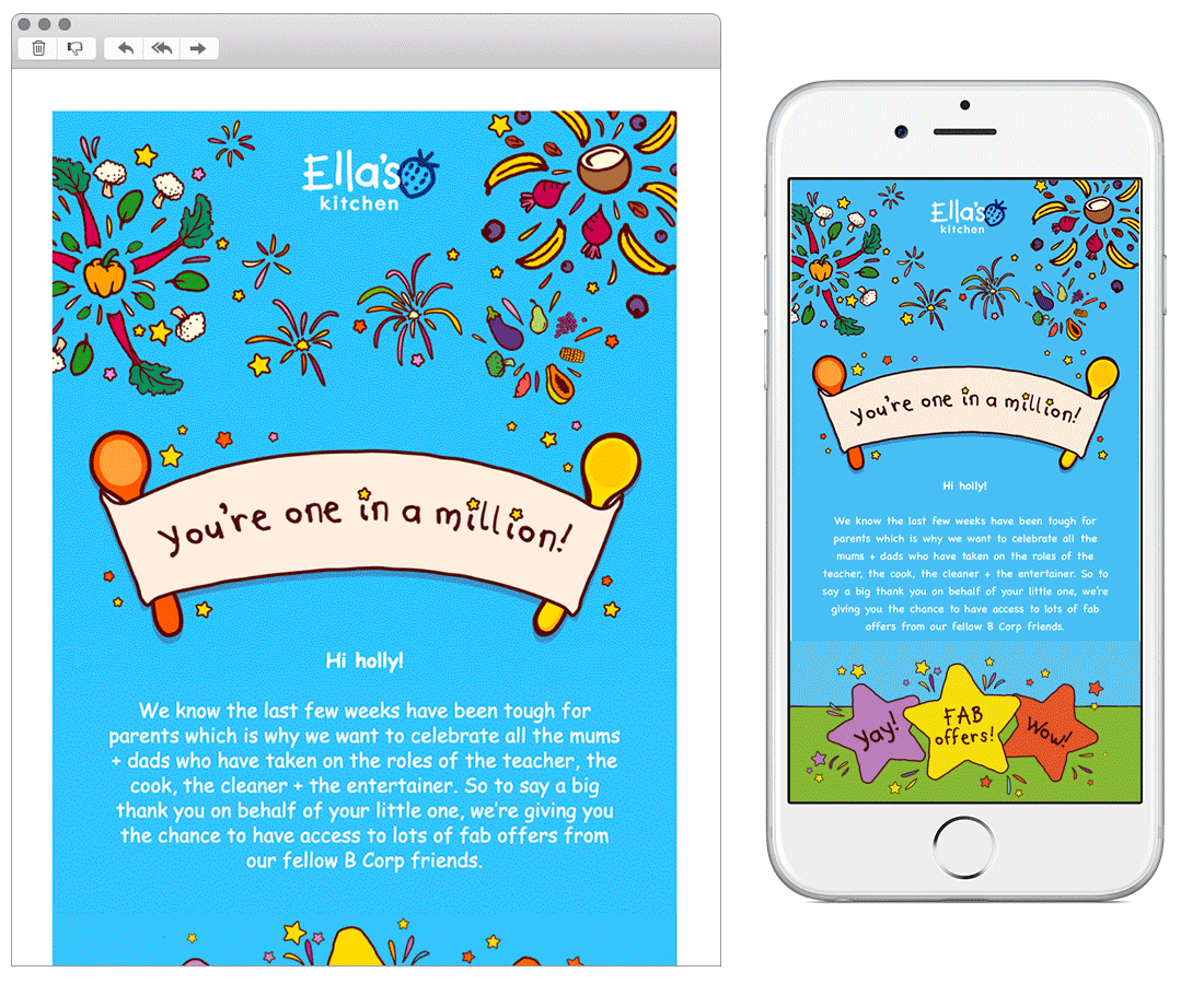
2. Ella’s Kitchen
SL: Exclusive FAB offers + treats just for holly!
Chosen for:
- Informative content. Ella’s Kitchen specifically want to target parents. With lots of tips, advice and recipes there is a lot of information to include in their newsletters. They manage to do this really well, through the use of bold colours and eye catching illustrations.
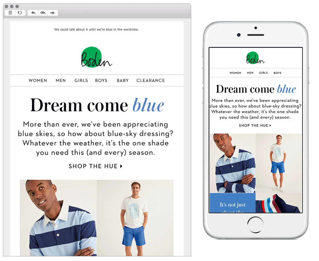
3. Boden
SL: It’s the calmest colour
Chosen for:
- Theme. Using a simple theme can work really well to make an email stand out in the inbox. Boden have done this well through the use of their subject line, email copy, imagery and colour theme. Everything ties in nicely and compliments each other in an easy to read mobile layout.
4. Kate Spade
SL: A creative workout you can do at home
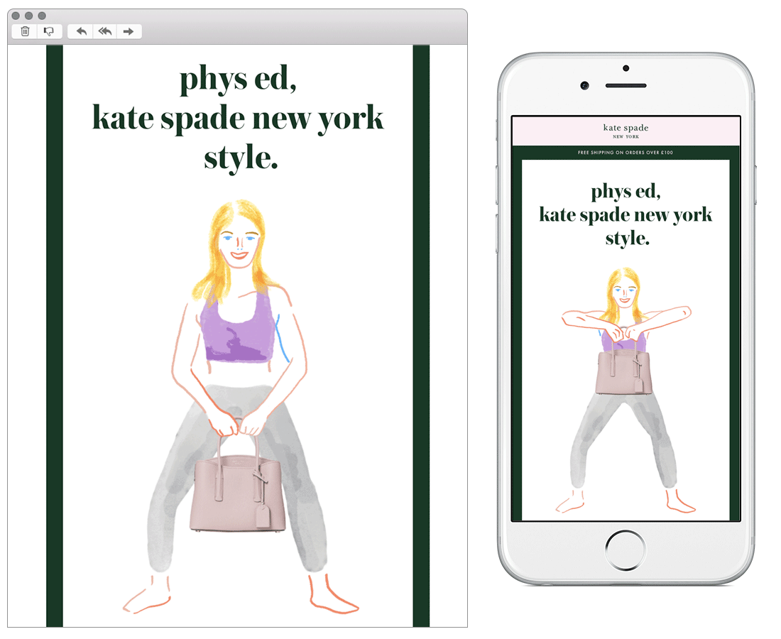
Chosen for:
- Animation. Kate Spade aren’t strangers to a good GIF, and this recent one didn’t disappoint. Mixing photography and illustrations together can be a great way to give some character to imagery. Their branding is still very obvious, making it clear what the email is about and demonstrating this in a fun way.
- Copy. The copy is minimal yet effective, highlighting the key products featured through whitty concise headlines.
5. Starbucks
SL: We’re ready to welcome you back
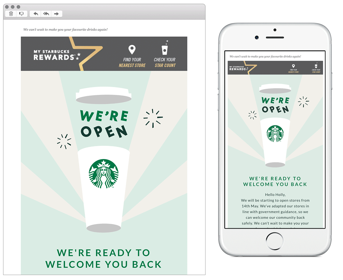
Chosen for:
- Simplicity. It’s important for brands to strike the right balance when sending out important messages like these. Giving enough information away, but in an engaging way. Starbucks have done this well through the use of icons, which break up the copy and allow the eye to skim read all the key information.
6. B&Q
SL: Handy tips to help you look after your home
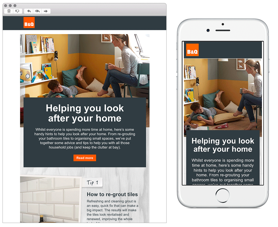
Chosen for:
- Helpful content. B&Q have used a simple list design to make their top tips easy to read. Numbering the sections helps to give the user a simple path to follow, keeps things organised and keeps the user engaged. Each tip includes helpful content with the use of imagery and video, and the copy is rounded off nicely with clear CTA’s.
7. George Home
SL: DIY Duvet Forts
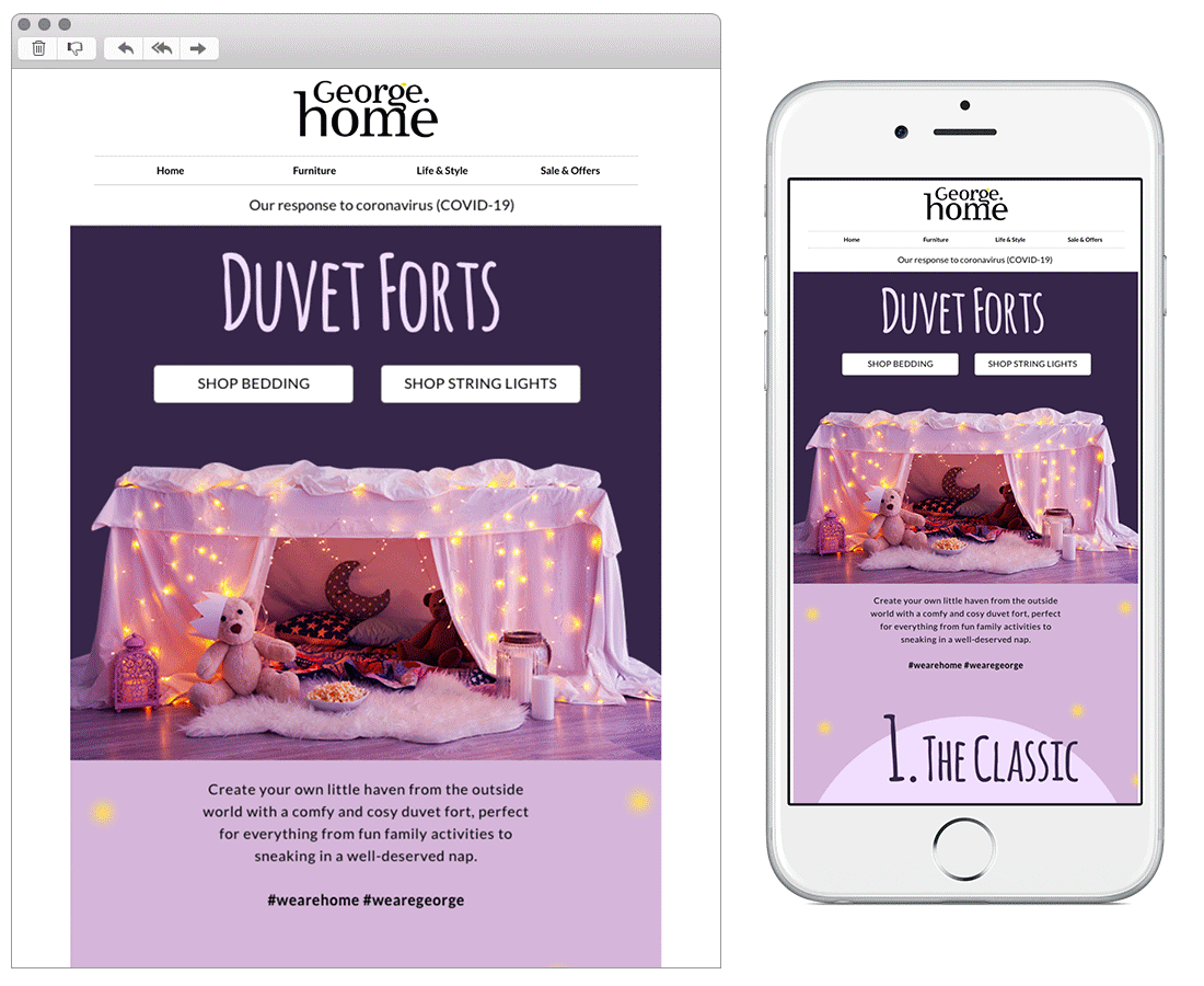
Chosen for:
- Helpful content. Another brand to use numbers well to break the email up nicely here. George Home have themed this design really well, starting with an eye catching photograph as the hero. Leading down the email they have a nice mixture of more photography and illustrations giving a hand-drawn element to the design.
Any you’ve loved that we’ve missed? Let us know on Instagram or Twitter.
Bex Highfield
Marketing Manager @ Action Rocket