Top Designs For March
With everything feeling a little uncertain right now, we want you to take a 5 minute tea break and enjoy our selection of top emails from March. So boil the kettle and enjoy!
1. Dulux
SL: Recreate a rainbow arc in 6 steps 🌈
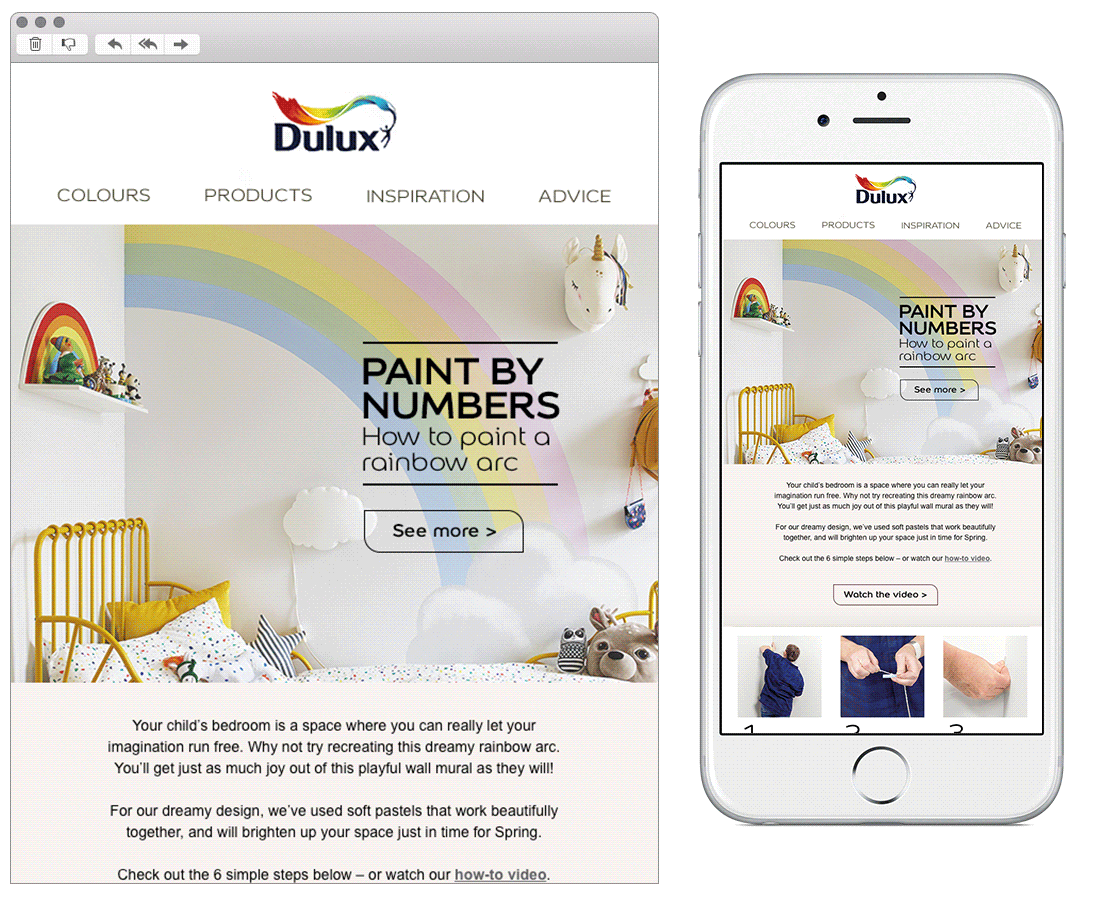
Chosen for:
- Content. Dulux have done a great job of theming this email. The design is imaginative and inspires by using clear step by step instructions. This has been done in a great mobile first approach, leading down the email nicely towards the different CTA’s.
2. Boots
SL: Advice from Boots Chief Pharmacist, Marc Donovan
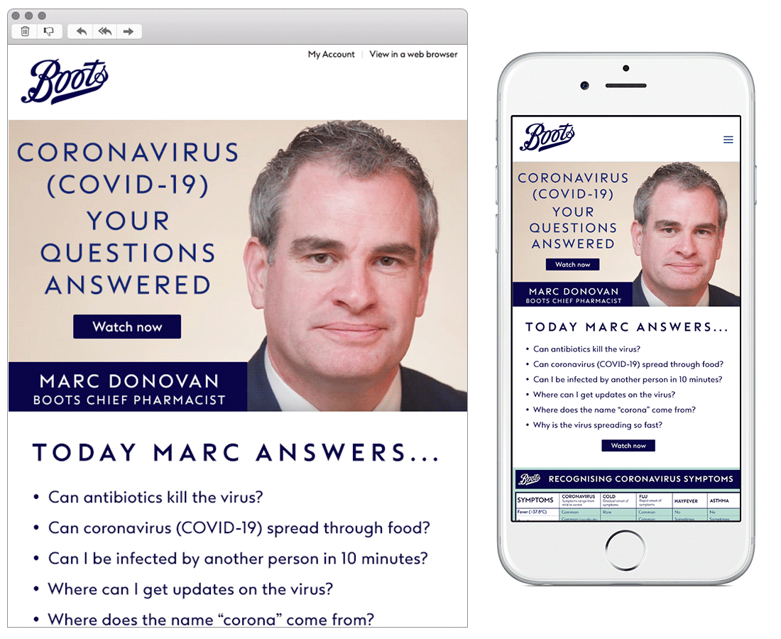
Chosen for:
- Messaging. A powerful solus email from Boots, containing only COVID-19 messaging. The brand have used their platform to highlight their knowledge and share important information. A nice example of a brand putting their subscribers first and not using their email channel for solely sales messaging.
3. Crabtree & Evelyn
SL: The New Normal

Chosen for:
- Content. This email leads with topical products the brand know their audience can currently relate to. Although this could have been done with a mixture of both images and web text, the current hierarchy of images and copy leads down nicely into each CTA.
- Social proof. A nice example of a brand using all channels within their marketing mix. Pulling in social feeds and encouraging the use of hashtags to direct subscribers to their Instagram page.
4. OKA
SL: Working from home?
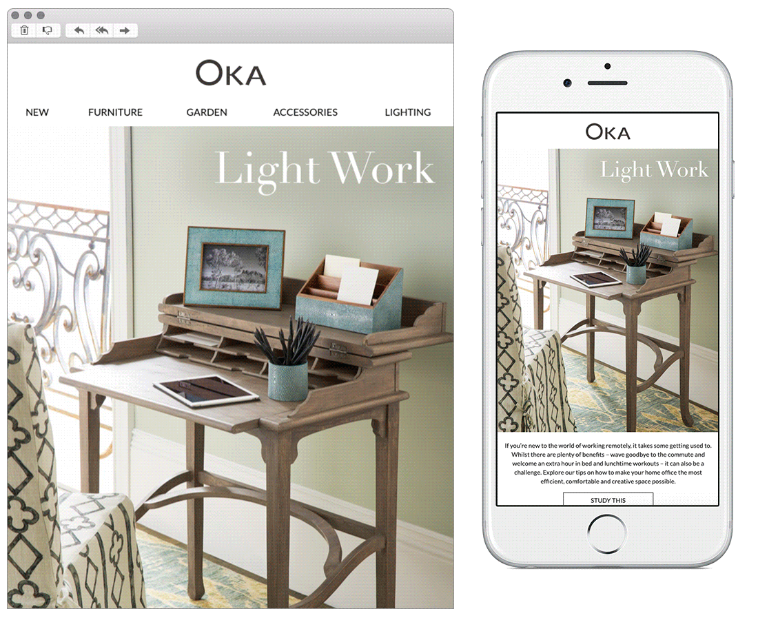
Chosen for:
- Content. The imagery chosen in this email really caught my attention on opening. Setting the scene nicely for the whole email, feeding the eye down easily into the secondary content. OKA have focused only on products they know people will currently be interested in. Although there’s quite a lot of content within the email, they’ve broken it up nicely between each module with the use of line breaks and headers.
5. Bourne & Hollingsworth
SL: See you on the other side 💕
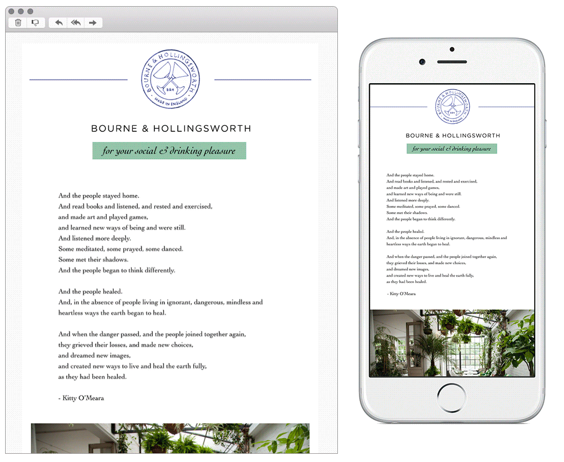
Chosen for:
- Impactful messaging. This email really left an impression when it landed in my inbox this month. After receiving what felt like thousands of closure emails it was nice to see a brand do something a little different. This one stood out with its emotional stance, heroing a powerful poem and following with ways to help the restaurant industry not just their specific business.
6. Casper
SL: Happy World Sleep Day!
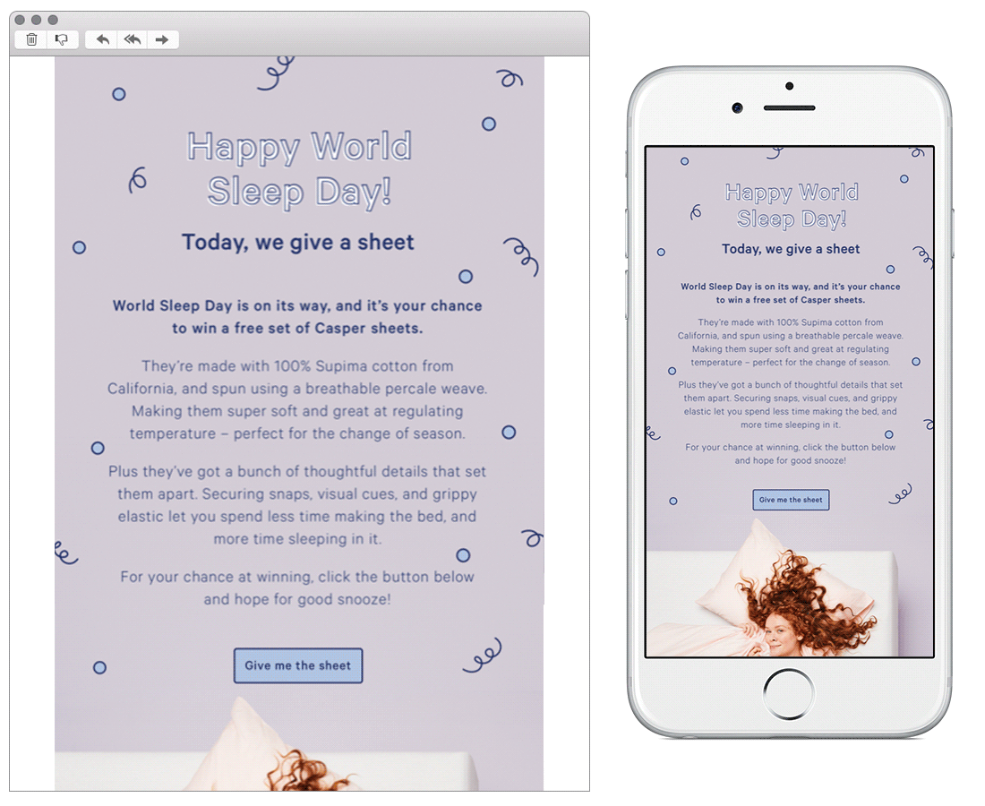
Chosen for:
- Great copy. Casper really have their tone of voice nailed, and successfully stick to it throughout their different channels. Being friendly, down to earth and human really does resinate with your audience!
7. Camper
SL: An Unexpected Change of Pace
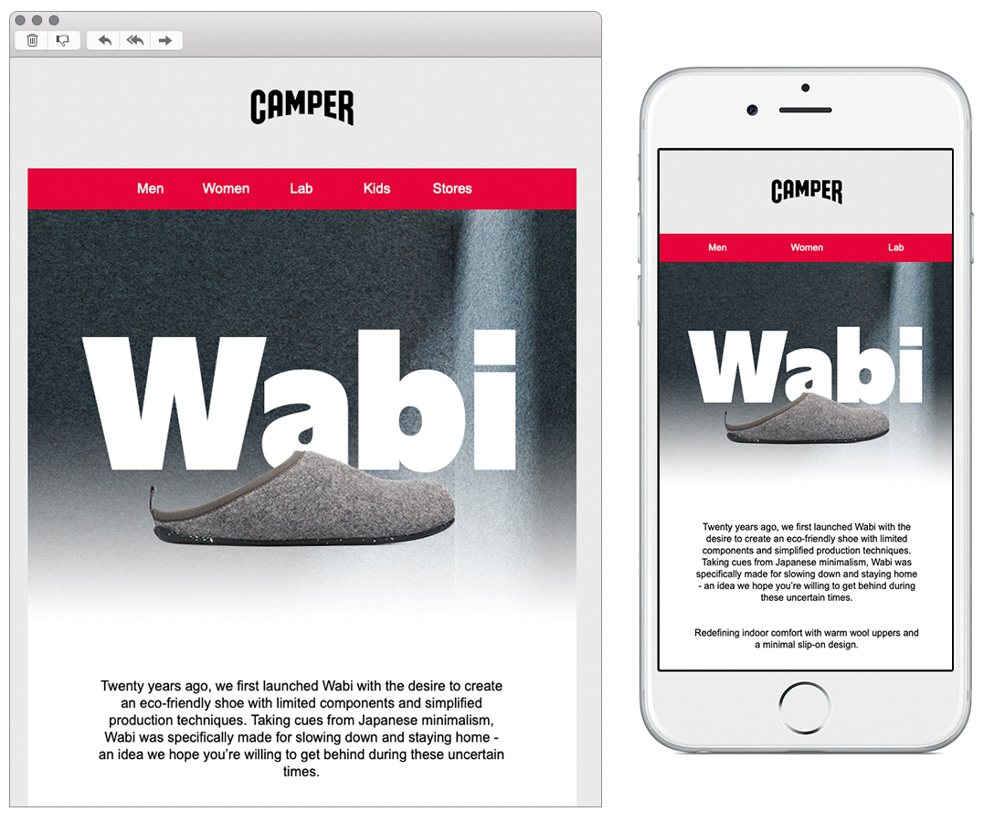
Chosen for:
- Reactivity. Being adaptive is so important right now for brands to succeed. Camper saw an opportunity here to push their slipper range. Theming the whole email around this, and really highlighting the quality of these products. They have a nice balance of imagery, icons, and copy. Using colourful animation to break the email up.
8. Bowden
SL: Here’s to you. Every you.
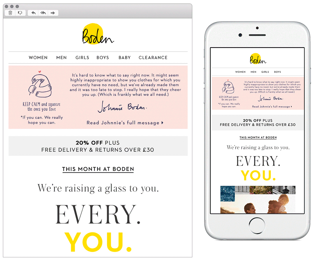
Chosen for:
- A human touch. How many of us have parked our usual office attire and are spending days in tracksuits and loungewear? Bowden have acknowledged this and included a nice hand drawn element to the hero banner. This works well with the thoughtful choice of copy, giving the brand an empathetic and human voice.
Any you’ve loved that we’ve missed? Let us know on Instagram or Twitter.
Bex Highfield
Marketing Manager @ Action Rocket