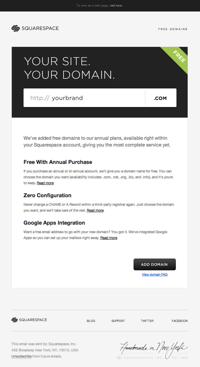
Email Inspiration: Squarespace dummy forms in email
Forms in email have always been a contentious subject – depending on who you ask, they’re either a very bad idea or very useful for generating conversions. Regardless, there are some places where they don’t work (Outlook 07 & Hotmail, for example).
However users have a lot of recognition for form elements, after all they use them online all day, and they associate them with interaction. Therefore, mock form elements, images that follow the visual style of form elements, can be a useful trick to engage users.
I’ve seen a few campaigns that mimic form fields, but this example from Squarespace is one of the nicest. It helps that there’s a clear concept, and the primary copy line of the campaign leads into the ‘form’.
Elsewhere, there’s a really strong content hierarchy – with short and punchy copy that’s laid out with lots of white space around it. This makes it easy for the user to scan, and also has the bonus of being easier to read on a mobile device.
