How we made the #emailweekly newsletter
Last week we sent our first #emailweekly newsletter, which replaces our old feedburner email alert that auto-sent when we’d written a new blog post. Now, being a blog about email design, we were never really happy with how the old emails looked, but at the time it did a job and we had more pressing things to do. This time around though, we thought we’d try out a few ideas.
For a start, we wanted to have more than just Email Design Review content. As you may have seen, we’ve started posting more in-depth code experiments at our new blog #ActionRocketLabs. Plus, since we started in 2009, a whole community of email design blogs and resources has built up, so we wanted to share our picks from other sites too.
We also wanted to take a progressive enhancement approach, and try out some new code techniques for email clients that support them.
Mobile-Up responsive
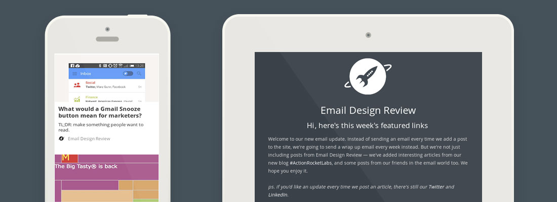
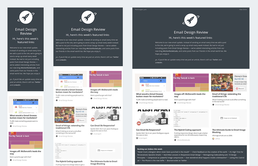
Over on our Labs blog, we recently posted posted about the Hybrid email coding approach. Essentially, it takes the conventional responsive email approach and turns it on it’s head. Instead of building a desktop email and then using media queries to adapt it for mobile, we coded the email to be 100% wide, and then used max-width, conditional comments and media queries to force an upper width limit.
The coding is slightly more complex, but theres two benefits: it means better mobile support for non-media query supporting apps, such as Gmail and new Android mail, plus it also means we can play around with wider emails on desktop. The upper limit we have is 960px, so the main links are displayed in a pinterest-style card layout on larger screens.
The trade off is there’s a slight alignment change at some screen sizes in Gmail and Yahoo, where the articles align to the left, not the centre, if there are only two articles on a row.
Web Fonts
We used Open Sans, via Google Fonts, as the main web font for the email. This then falls back to Arial where web fonts aren’t supported. The code is very similar to that in our web fonts in email article.
CSS rollovers
We added an opacity transformation that happens every time the user rolls over one of the main stories. The table for each story has an opacity of 0.75 by default, and then on rollover that changes to full opacity. There’s a bit of CSS transition on that too, so it fades in and out over half a second. Support is pretty good across the devices, though one thing we did do was remove the effect for mobile/touch screen devices, as hover doesn’t really exist there.
Production
We’ve been busy building an email content management system called Taxi, and the #emailweekly newsletter was a perfect opportunity to give it a test run.
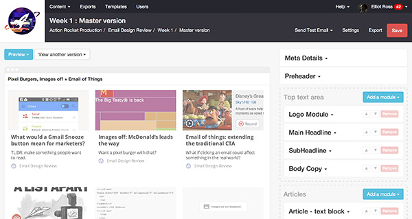
It means we can easily drop in content as we find it, and then before we send it’s a simple export to Campaign Monitor, our ESP. We’ll be making Taxi available to use soon, you can get to the front of the queue here.
To get this week’s #emailweekly, drop your email in below.