Accessibility in Digital Marketing
In the world of Digital Marketing, every brand aims to deliver the perfect email experience to its subscribers. But what about those who have needs beyond your standard subscribers?
Accessibility is described as a being “a product (a website, email or application) that can be used by people of all abilities and disabilities”.
Accessibility is also a legal requirement within the digital space. Whilst email is often overlooked (for now) it’s still good practice to ensure you’re doing what you can to help. By implementing any level of accessible best practice, organisations can be opened up to a larger audience.
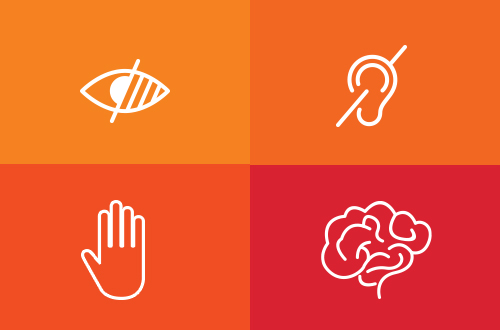
There are 4 categories within accessibility consisting of:
Auditory – For hearing impaired users. Including: Deafness, people with hearing aids and auditory processing disorders.
Visual – For sight impaired users. Including: Blindness, colour blindness and glaucoma.
Motor – For users with Physical impairments. Including: Cerebral palsy, RSI and Parkinson’s.
Cognitive – For users who have difficulty processing information. Including: Autism, Down’s syndrome and Dyslexia.
Accessibility covers a wide range of abilities, each with very different needs. We’ve highlighted some key areas below, to help make Email communications as accessible as possible.
Use strong contrast between text and background colours
People suffering from visual impairments can find it difficult to distinguish between colour and text. It is important to choose colours which compliment each other for both aesthetic and accessibility reasons.
Tip: Once your email creative is approved, try grey scaling the design to see if all the key content is still clear and readable. Email on Acid offers a campaign precheck tool, which flags anything needing adjusting before send.
Consider font size, line length and text alignment
Brands should ensure font style and sizes are readable across all devices. Font sizes should be no smaller than 14 pixels for desktop and 16px for mobile. Paragraphs and sentences should be no more that 50-60 characters in length, and aligned to the left for optimum readability.
Tip: As a rule of thumb you should be setting the line-height to 1.5x the size of your text.
Be mindful of animation
Animation within email can often help to bring an email to life, but it can also cause confusion to some readers. You should be mindful of fast or flashing content, as this can cause seizures or bouts of vertigo for some recipients.
Tip: If you feel as though your animation is too fast then try reducing the frame rate or speed.
Use a descriptive subject line
The subject line is always the start of any communication. To bring context and value it is important that it has meaning. It should be descriptive, and make sense without the use of emojis. For the visually impaired, a good subject line forms the basis of opening the email or not.
Tip: Try not to use any word abbreviations, and don’t repeat the sender’s name.
Making your code accessible friendly
By using the appropriate semantic tags (<h1>,< h2>,< p>) and using aria attributes, brands can make their content more accessible to everyone.
Tip: Add role=”presentation” to every <table> you use. This prevents screen readers from conveying every line of code, and instead focuses on the content. Also add and role=”none” to tables which have no content and are just for layout.
Always provide alternative text on images
By adding alt attributes to imagery, content of the image is described when it cannot be rendered or seen. Screen reading software will pick up this text, and repeat it back to the user so they can interact with the content.
Tip: Make sure your alt text describes exactly what is being seen in the image (great example of this here).
Accessibility For Social
Instagram have recently announced their new feature of alt text on their images. This is designed to improve the UX for the visually impaired and for those using screen readers. The new tool will scan images and use recognition techniques to generate image descriptions. Screen readers will now be able to list all written items that photos may contain whilst using the app. Showing users more of what they like, providing a more engaging social experience. Instagram is the first platform to publish content which can be read by Google. This will help with SEO efforts and enable Instagram content to live and be discovered beyond Instagram.
In keeping with accessibility requirements, disability-themed emojis have now been approved. 2019 will show the introduction of new characters, including hearing aids, wheelchairs, prosthetic limbs, and guide dogs.
Keeping ahead of the digital curve is vital across both email and social channels. It is important for brands to ensure their content can be consumed easily, and by everyone. We will soon be publishing an accessibility guidelines blog post. This will include email clients challenges and workarounds.
Bex Highfield
Marketing Manager @ Action Rocket