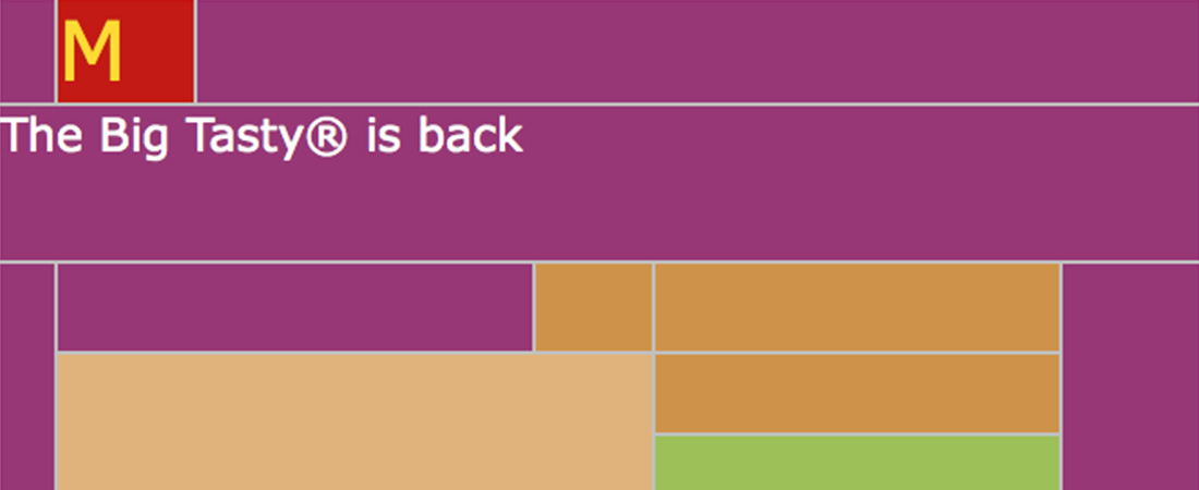
Images off: McDonald’s leads the way
We’ve talked before about making the experience better for users with images turned off, but it’s still something that is frequently missed by email coders. This example from McDonald’s includes a few best-practice techniques, such as styling Alt-text and clever use of background colour, plus…