Top designs for (Vegan)uary 🌿

Due to the influx of all things Vegan in January we thought we would dedicate this months top email designs to all things Vegan, enjoy!
1. Burger King
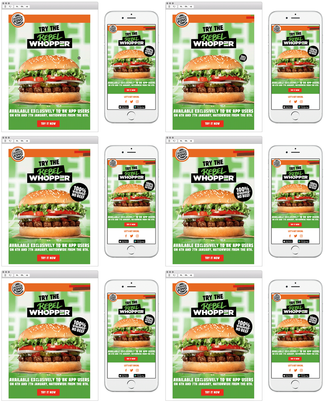
SL: 100% WHOPPER, NO BEEF… The Rebel Whopper has arrived…
Chosen for:
- Solus impact. With the launch of Burger King’s first vegan addition to their menu, this solus email was sent out to consumers to create a stir. They’ve lead with a simple mobile first image, with great impact due to its bright colours and short punchy copy, proving new menu launch emails don’t need to be lengthy and boring.
- User journey. Although this solus email is short and sweet, the brand have still thought about the whole user journey. They have used urgent copy to really highlight the exclusivity of their app to its users, and all CTA’s link to the different app stores.
2. The Body Shop
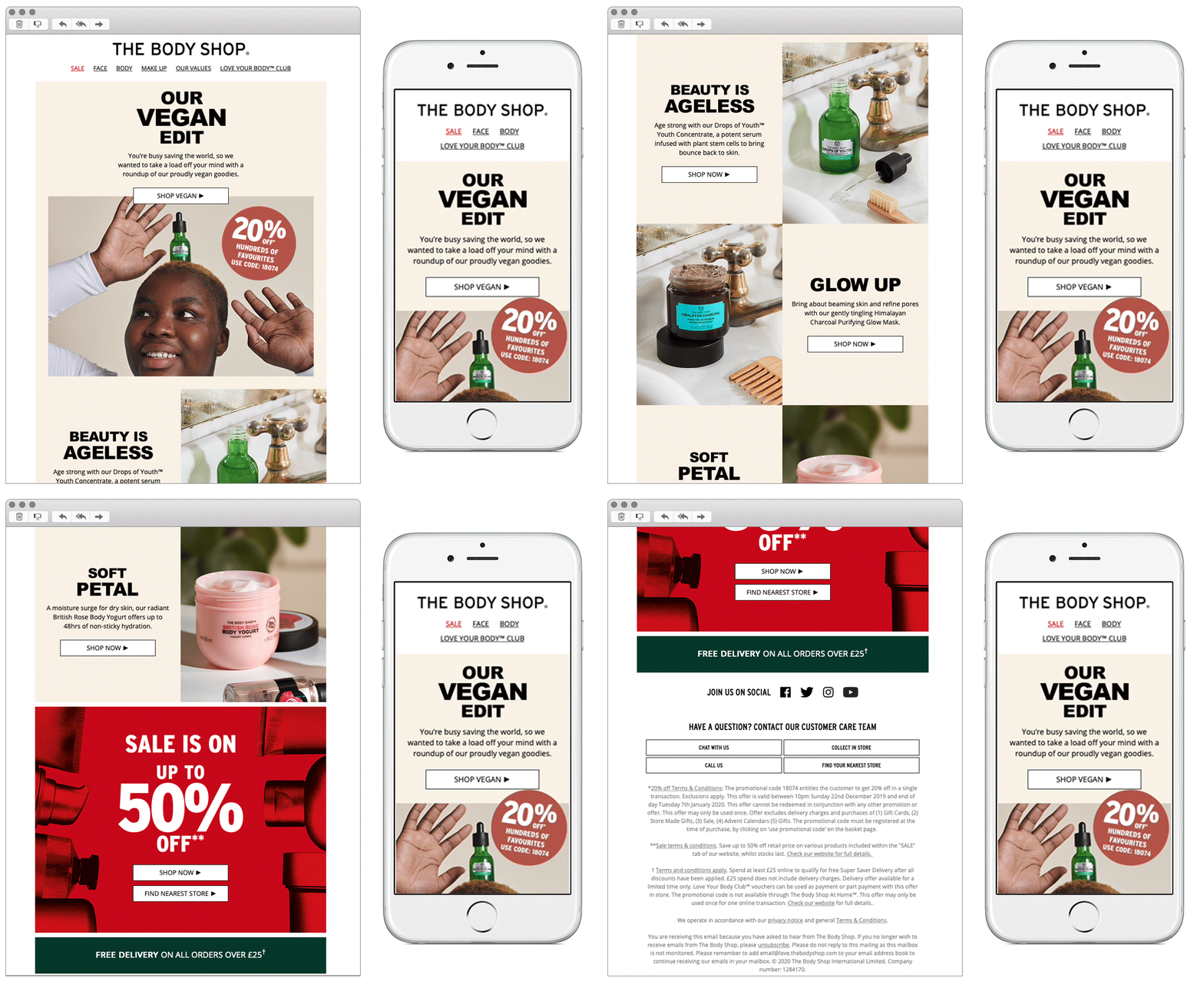
SL: Happy Veganuary! New year, new you 
Chosen for:
- Simplicity. A lot of brands have decided to shout about their new vegan ranges through bright colour themes and bold branding. The Body Shop are already known for their vegan products so don’t need to push a big sales message to their subscribers. Instead the brand opted for a neutral themed email, simply highlighting their relevant products. Using a mixture of both product shots and a nice lifestyle hero photograph to break up the email.
3. Frankie and Benny’s
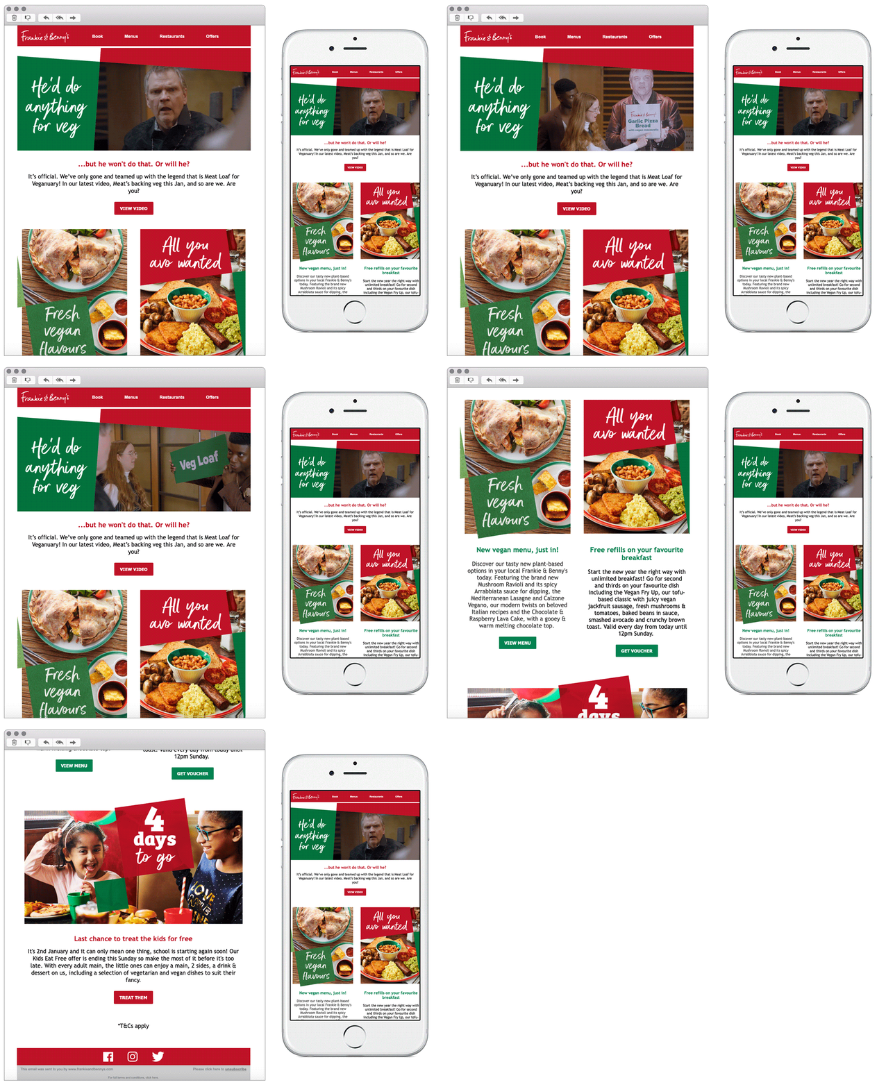
SL: Our new vegan menu is here
Chosen for:
- Humour. Another brand to release their new vegan menu in January was Frankie and Benny’s, again mostly known for their meat focused meals they needed a solus email to announce the new menu choices. They have partnered with the famous singer Meatloaf to promote their vegan campaign and included this within the hero. With a clever use of copy it bought a refreshing humorous tone to the email, making them stand out amongst competitors.
4. KFC
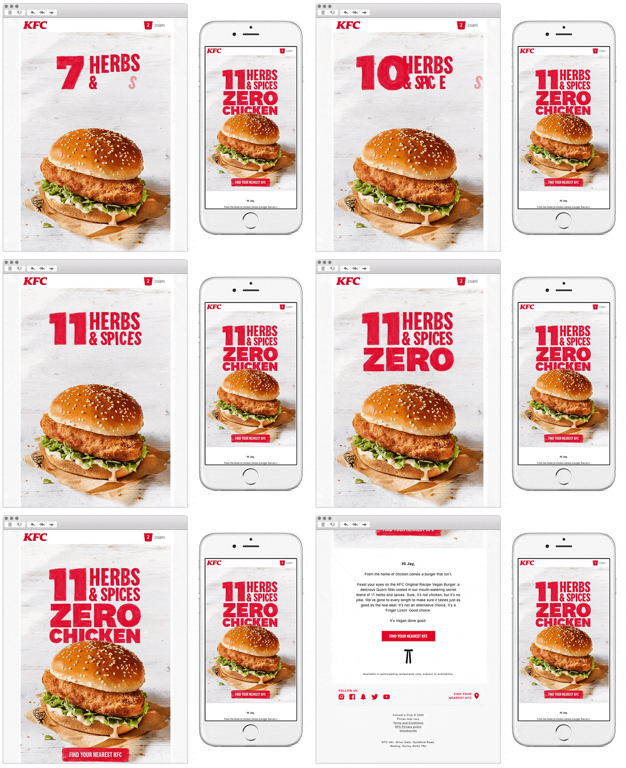
SL: A KFC VEGAN BURGER?
Chosen for:
- Hero impact. With many of their rivals also announcing their new vegan ranges KFC kept this email simple. Hero’ing their most popular new menu item, using close up photography with animation – drawing the recipients attention straight away.
- Copy. KFC have kept the branding of their new range as similar to their meat menu as possible, using the same ’11 herbs and spices’ phrase as they do for their regular chicken. This is nice because not only are they trying to market a new audience, but also seem to be trying to appeal to their current customers.
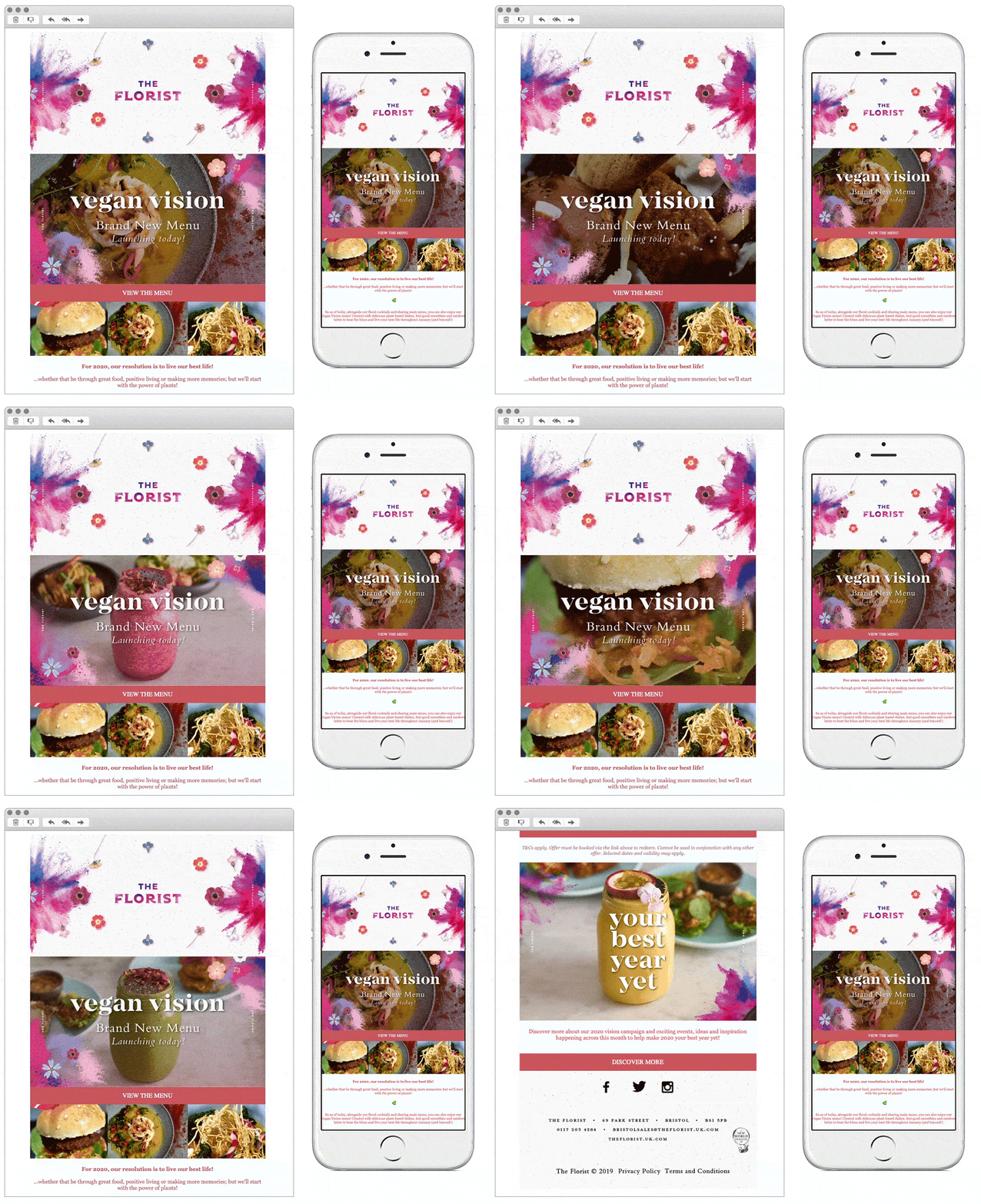
5. The Florist
SL: All new, all vegan… 💖🌿
Chosen for:
- Consistent branding. Throughout their website and even in restaurants, The Florist have a very distinct and recognisable brand using floral prints throughout. They also tie this theme in nicely to their email newsletters, and this vegan solus is no different. Choosing the most eye catching and ‘on-brand’ imagery to compliment the feminine colour theme.
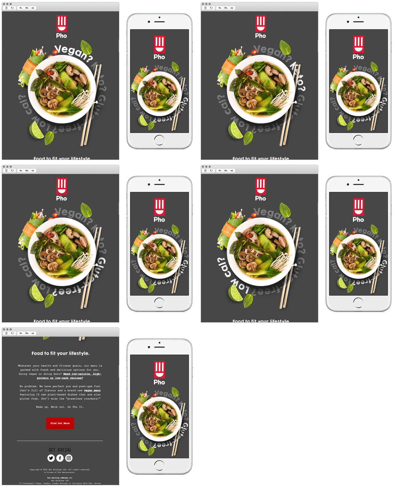
6. Pho
SL: Wake up. Work out. Go Pho It.
Chosen for:
- Simplicity. Simple animation makes this email easy on the eye, they aren’t bombarding you with too much information yet still highlighting their food through a nice hero photograph and animation.
- Theme. Although this email is vegan focused, they haven’t completely dedicated it to solely ‘vegans’. The copy lists different dietary requirements, in a non ‘diety’ way. I like this way of messaging from a brand, they’ve successfully managed to cater for many audiences.
Any you’ve loved that we’ve missed? Let us know on Instagram or Twitter.
Bex Highfield
Marketing Manager @ Action Rocket
