Top Designs for May
There are no lengths we wouldn’t go to in order to source the very best of the inbox and this month we have some amazing examples. Hopefully, this variety will titillate the senses and provide inspiration. Enjoy!
1. Ann Summers
SL: May has come, and so will you
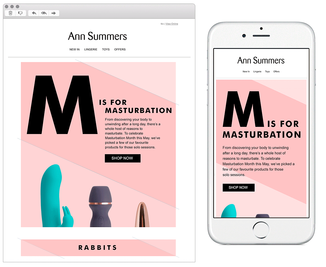
Chosen for:
- Content – With brands like Ann Summers email is a minefield, spam filters block the slightest risque word making hitting the inbox a real challenge. This designer has tackled the challenge head-on ensuring any risk is swiftly manoeuvred using smart coding techniques. Amazing!
- Stylish – This stunning design highlights the array of products well, linking them together in a fun way. Pulling your eye down the page seamlessly, and finally ensuring the whole thing works just as well over a mobile device. Also that subject line… bravo!!
2. Marks & Spencer
SL: Holly, don’t miss out on your May Sparks food offers
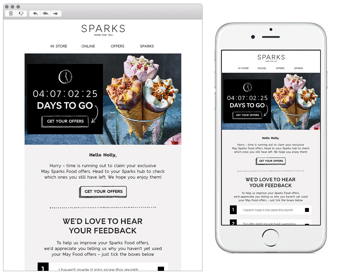
Chosen for:
- Interactivity – This email is interactive from head to toe, from the countdown clock highlighting how long I’ve got to redeem my offers to the feedback poll which provides different responses based on which tick box you chose. All of this interactivity is nicely based within the email.
- Visuals – I love the simplicity of this email, M&S don’t use reams of copy or visuals to pull away from the core message but add supporting food visuals and icon’s help to tempt you and explain how simple claiming an offer is.
3. Lastminute.com
SL: Festival fever is here. Come join the party! 
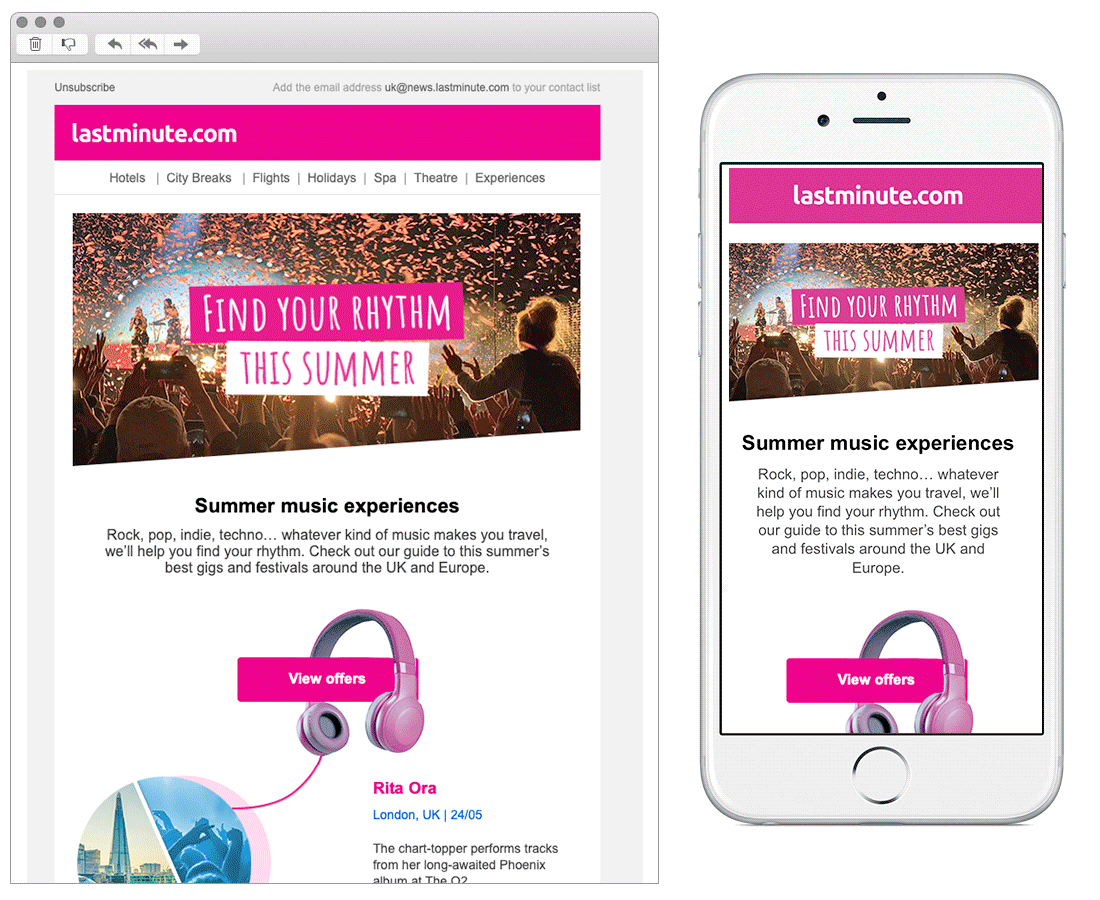
Chosen for:
- Theme – Lastminute.com’s email theme is great, I love the way they use headphones to connect the concerts and pull you down the page. This stacks well within a mobile device. The great use of fonts, pops of pink and concise copy bring this together in a well thought out design.
4. Topshop
SL: Time to shop swimwear
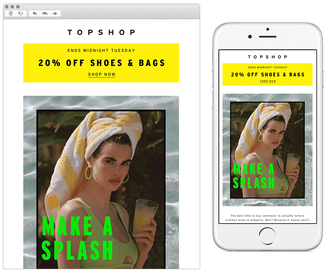
Chosen for:
- Design – This is a very striking design from Top Shop, the use of headlines sitting amongst the copy in such a visual way and additional animation make this a stand-out email.
- Mobile Design – It’s very rare that an email design works just as well in desktop as it does in mobile but Top Shop has nailed this. Images, animation, CTA’s, and copy all resize seamlessly regardless of medium your viewing.
5. Argos
SL: Travelling home or away?
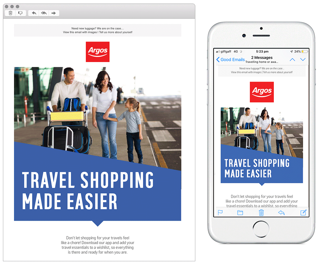
Chosen for:
- Approach – Argo’s travel-themed email is a great way of cross-promoting the app. They start well with a relevant pre-header and then seamlessly transition into clearly highlighting how to use the app with step by step process. Finally, they end well with key categories relating to holidays and luggage or entertainment guides to help with travelling.
Any you’ve loved that we’ve missed? Let us know on Instagram or Twitter.