Sophie’s Top Designs for July
After over 3 months of travelling around Latin America, I’m back!
Sorry that my blog posts have been some what, NON-EXISTENT. Feel free to stalk my instagram account to see what I’ve been getting up to instead! Here’s my top inbox picks from July…
Channel 4
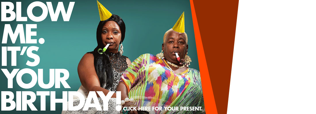
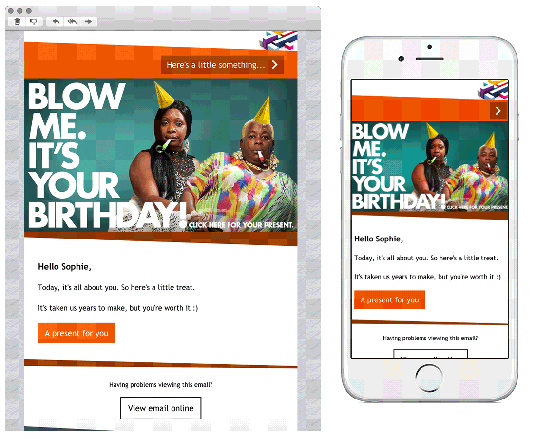
SL: A birthday present for you!
Chosen for:
1. Element of surprise – unlike most birthday emails which have products to sell, Channel 4 have to take a slightly different approach. I found the surprise CTA and landing page a little more refreshing than the standard discount code. There is a video on the landing page… you’ll just have to sign up and wait until it’s your birthday to see it!
2. Emerald
SL: [1/4] Good morning!
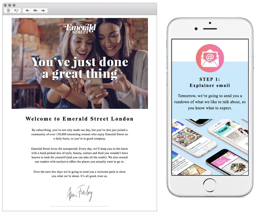
Chosen for: A nice example of a good welcome email. It has a simple and clear step by step layout of what you can expect from future newsletters. This also transitions well on to mobile view.
3. & other Stories
SL: Lovely Lace-up picks
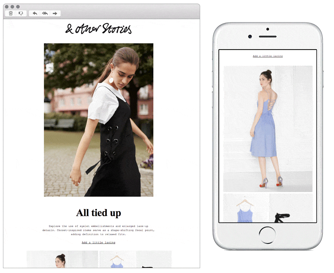
Chosen for:
1. Use of images to create pinterest/instagram grid style layout. This also breaks up neatly in the mobile version.
2. Breaking the rules in favour of brand identity – As email designers we often have it drilled into us to use clear fonts and big obvious CTAs. However, this doesn’t really suit the minimal and sophisticated design identity of this brand. Going against the norm works well here.
4. Neom
SL: Wellbeing. Festival-style
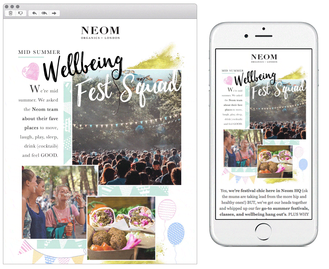
Chosen for: Layered illustrations and imagery put together in a way that makes this Mailchimp template look and feel a lot less like a template. This handmade style matches the organic brand identity well too.
5. Fossil
SL: FYI – 20% Off sale Styles
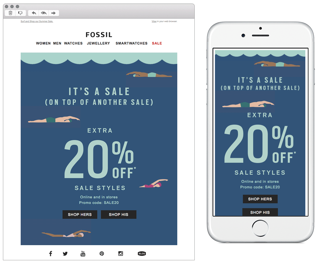
Chosen for:
Being eye-catching without the use of any garish bright red colours, often seen in sale emails!
All emails can be found on my Pinterest board.