Email Retrospective 2016
At our last Email Meetup we switched from peering into Future of Email and took a stone cold look at the past.
Now email has pretty much fully evolved into the mobile era, we thought it would be interesting to take a look back at some nice familiar brands and see how they made the leap into mobile – and also if we can spot any trends along the way.
BOSE
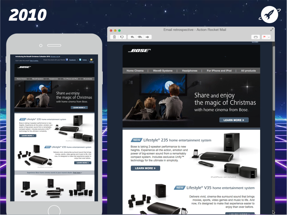
2010: View email
• Compact view
• Tiny, cramped text
• Print-like layout
• Not responsive
This email from 2010 certainly has a Bose feel to it, but is clearly designed for a time when we looked at our email on a bigger screen. The tight, print-like view does all it can to squash a lot of content into a small space.
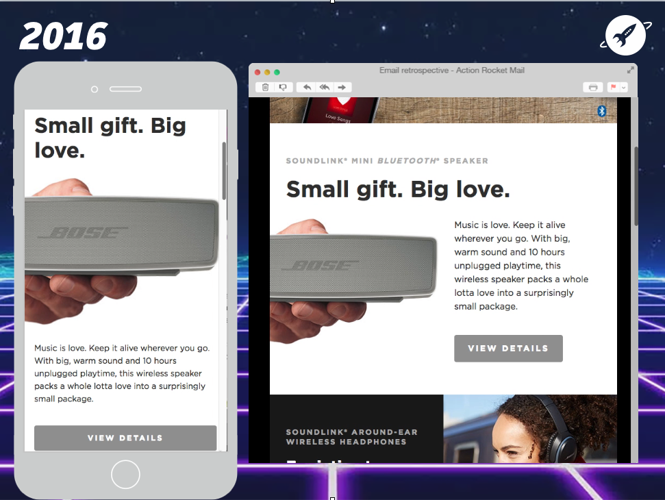
2016: View email
• Increased white space
• Bigger text and line height
• Modular layout
• Responsive
Jump to 2016 and it immediately obvious that this design has come a long way. Content is more spread out and easier to scan and read, with increased white space, larger text and line heights, and a cool modular layout. Add in the responsive design, some great photography and we have ourselves a winning email.
Spotify
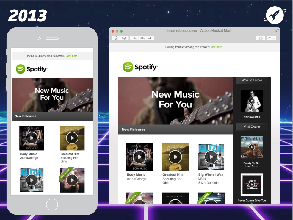
2013: View email
• Nice design, but a little more cramped towards the end…
• Has a desktop feel
• Responsive design – great!
• But some content disappears on mobile – weird!
This 2013 design from Spotify still looks pretty fresh today, but has some more compact design elements towards the end (Scroll to Spotify Picks https://litmus.com/scope/puxbtnpv93ee). This gives it a distinct desktop-y feel. On an interesting note, notice that the black side bar totally drops out on mobile? This raises the question that if it’s ok to drop out on mobile, is it worth including at all?
2016: View email
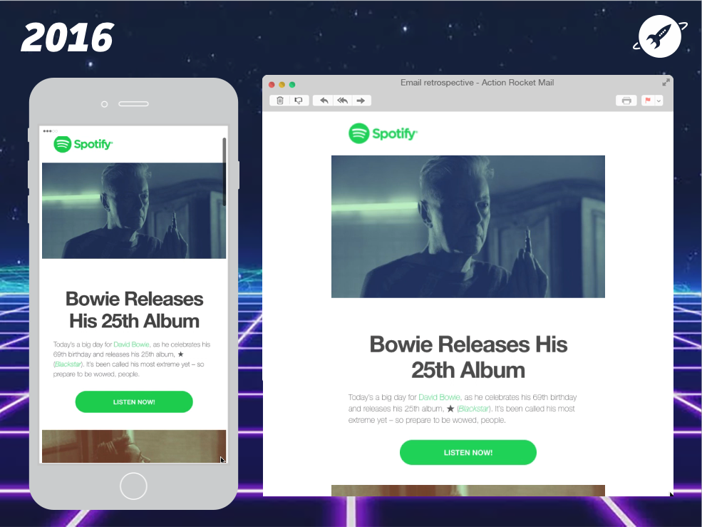
• Huge bold title
• High contrast (black on white text)
• Increased text size & line height
• Tons of spacing
• Chunky CTA
• Designed with mobile as a priority?
Here we see a pretty radical departure from Spotify’s previous email. They have pared back their design and distilled it to the core essentials – single column, big images, big text, more white space and a chunky CTA. All these design decisions are almost certainly driven by an increased readership on mobile – making the email as easy as possible to read on a small screen.
An interesting difference between the 2013 and 2016 emails is the role reversal of desktop and mobile. The 2013 email is a desktop email designed to work on mobile and in 2016 we’re seeing a mobile email that’s designed to work well on desktop.
John lewis
2012: View email
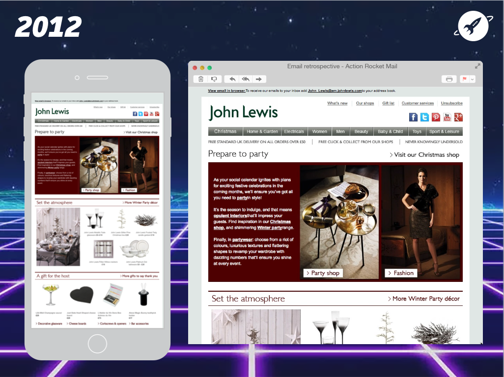
• A whole heap of text
• Large navigation bar
• Difficult to know where to focus
• Webpage-like email
• Not responsive
The first thing you might notice about this design, is how much content there is. So much so that It looks like a website in an email.
It has a big navigation bar, a three paragraph introduction and a lot of other text. This makes it somewhat difficult to know where you should focus your attention, and makes it had to ‘scan’ the email to work out it’s main message.
2016: View email
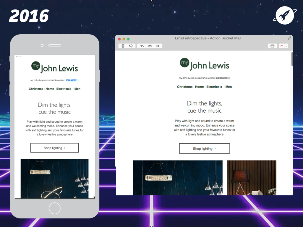
• Increased text size, line-height and whitespace
• Drastically reduced navigation bar
• Succinct text
• Still a lot of information, but never too much at once
A quick look at this 2016 redesign, and we can start to see a clear pattern emerging among these examples. Larger text, line height and increased spacing is popping up everywhere, making emails easier to read as they do not overload you with information.
Now, this John Lewis email still contains an enormous amount of content, but the trick here is that they make sure you can never see too much at once, so you always know what you’re supposed to be reading and never feel lost.
Where are we now?
From looking at how email design has progressed into 2016/17, it’s clear to see that mobile is now at the forefront of design decisions. This should, of course, not come as any great surprise as mobile has been the primary way people read email for several years.
However, it is interesting to see exactly how business have adapted their designs, incorporating:
• Pared back design – Emails have be stripped right back to their core content.
• Large images
• Large, succinct text
• Large CTAs
• No superfluous design elements
• Lots of whitespacing around elements for easy readability
One thing of note in the Spotify, John Lewis and even this Lonely Planet example is that by stripping the design so drastically, they look very similar at a glance. What they gain in easy readability, they lose in branding. A pitfall which can be avoided, as shown in the Bose example.
So, there we have it! If you’d like to a bit of a deeper insight into all things email, keep an eye on our London Email Meetup page and come and say hi at our next event.