Email Inspiration: MTV UK Newsletter

Update – see comments section for feedback with the design team.


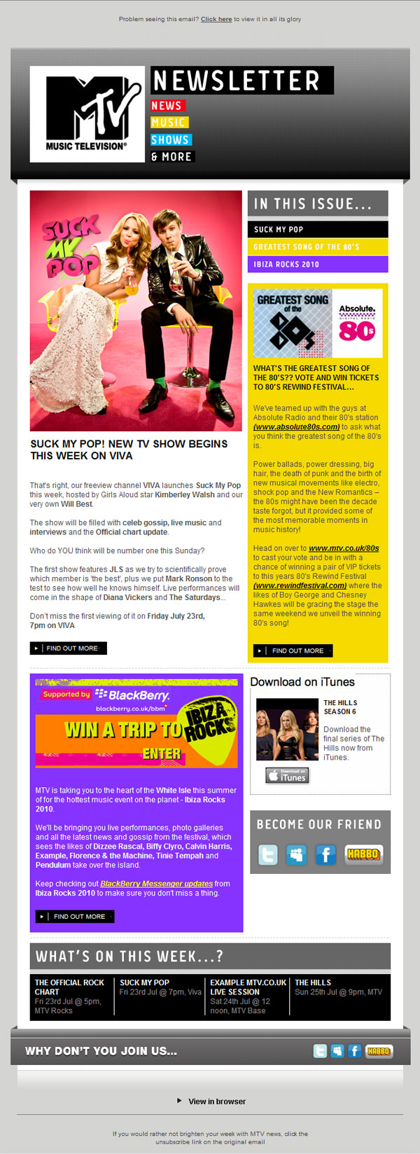
MTV UK‘s new email newsletter broadly follows some best practice, but there’s a few tweaks that could be made to really make it perform. The design and branding is very strong, and neat tricks like the header and footer breaking out the main column serve to add depth to the design. Strong call to actions help drive to areas of the site, although they’re currently very low down – and there’s very little to drive clicks from the preview pane area. The ‘In This Issue’ box serves to draw attention to the articles further down, although the newsletter could be more enticing with more, smaller articles, across a wider range of interests.

Items to build on could include reducing the real estate that the all image header takes up, optimizing the preview pane area, (further) customizing content and adding social sharing.


  • not another designer

    This isn’t new unfortunately and looks to have gone down hill in terms of design, call to action and use of space. I was the designer who did the original first 5-7 issues of this email before it was put on the back burner by MTV and has been taken over by a different company – feel the comments above to be completely true.

    The original http://static.mtv.co.uk/marketing/HTMLemail/weekly/19oct09/MTV-template-web.html was designed to give you as much info while keeping the design fresh using the MTV branding. We used the header more as a call to action and “in this issue” originally had more stuff packed into it. Also feel its a shame the “spotted section” got dropped – this area of the newsletter was starting to get it’s own look and feel!

    Have a look at the below to see what you all think? Be good to see more comments on what you thought of the original and what is currently being used:

    http://static.mtv.co.uk/marketing/HTMLemail/weekly/19oct09/MTV-template-web.html
    http://static.mtv.co.uk/marketing/HTMLemail/weekly/09dec09/MTV-template-web.html

  • http://www.elliot-ross.co.uk Elliot Ross

    Interesting! I think that kind of thing happens a lot, and it’s a shame as the features that have dropped out of the original versions are things that really help drive loyalty and help encourage recipients to look out for the next edition. ‘Email exclusive’ content like the ‘spotted at MTV’ box is a good example of this in action.

    Also like how the drive-to-social module is nice and high in the original, and also there’s a clearer order of hierarchy. I’d still argue that some of the content could be cut down further on some of the larger modules.

  • not another designer

    This isn't new unfortunately and looks to have gone down hill in terms of design, call to action and use of space. I was the designer who did the original first 5-7 issues of this email before it was put on the back burner by MTV and has been taken over by a different company – feel the comments above to be completely true.

    The original http://static.mtv.co.uk/marketing/HTMLemail/wee… was designed to give you as much info while keeping the design fresh using the MTV branding. We used the header more as a call to action and “in this issue” originally had more stuff packed into it. Also feel its a shame the “spotted section” got dropped – this area of the newsletter was starting to get it's own look and feel!

    Have a look at the below to see what you all think? Be good to see more comments on what you thought of the original and what is currently being used:

    http://static.mtv.co.uk/marketing/HTMLemail/wee
    http://static.mtv.co.uk/marketing/HTMLemail/wee

  • http://www.emaildesignreview.com/ Elliot // Email Design Review
    Interesting! I think that kind of thing happens a lot, and it's a shame as the features that have dropped out of the original versions are things that really help drive loyalty and help encourage recipients to look out for the next edition. 'Email exclusive' content like the 'spotted at MTV' box is a good example of this in action.

    Also like how the drive-to-social module is nice and high in the original, and also there's a clearer order of hierarchy. I'd still argue that some of the content could be cut down further on some of the larger modules.