Top Designs For September

This month we’ve sourced our whole teams inbox’s to give you an array of our top September emails! Hopefully our choices will inspire and delight your email senses, enjoy!
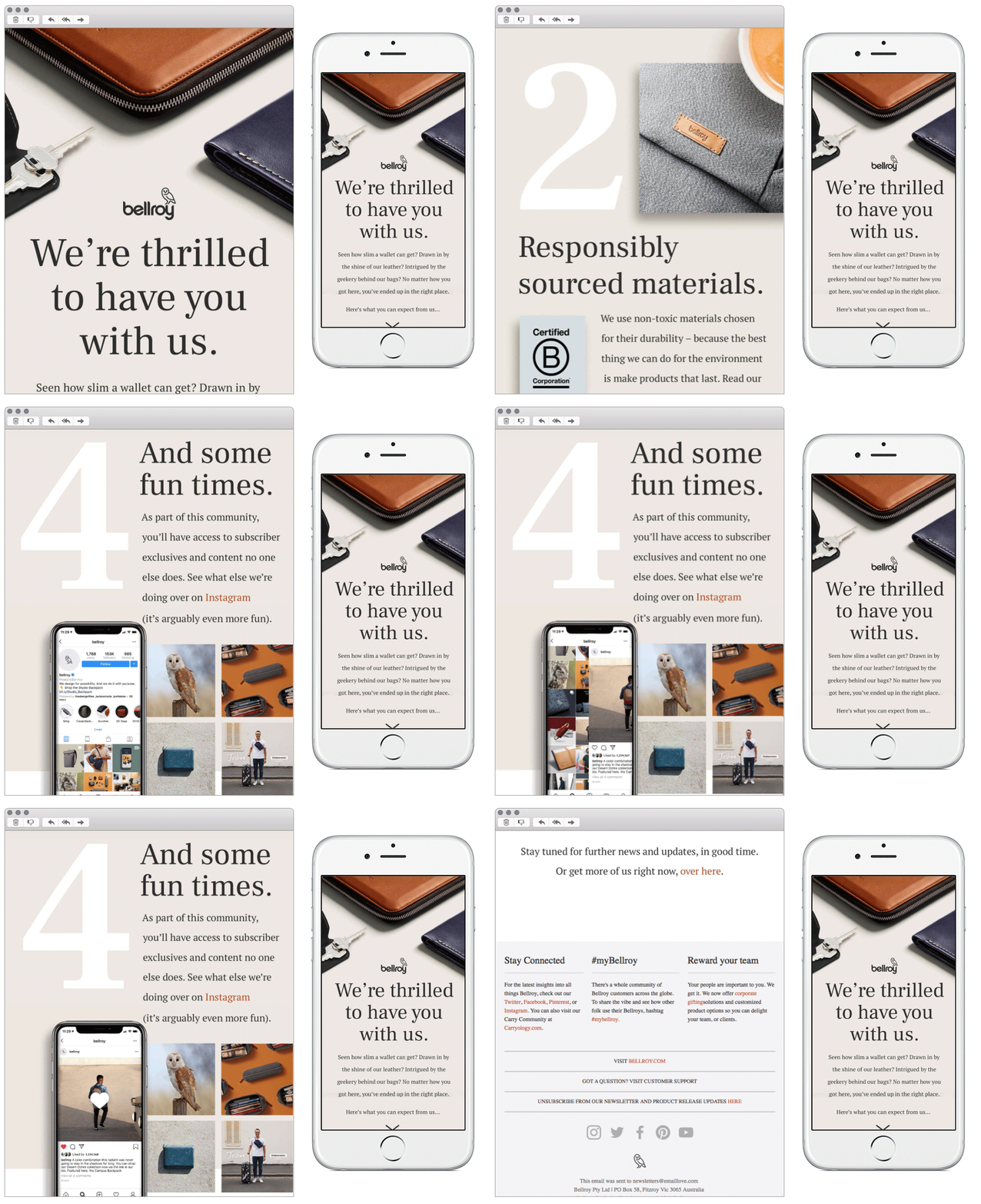
1. Bellroy
SL: You’re in. Welcome to the family
Chosen for:
- The scroll – This email leads with an eye-catching hero, and demonstrates a nice way to showcase a ‘what you can expect from us’ list using both numbers and imagery. Each module uses an interesting composition of imagery with text and provides the eye with something new each time.
- Design – There is a nice mix of imagery, copy, and GIF’s throughout this email without it feeling too over-crowded. I like the use of white space and how they have used it to highlight a simple quote in the final module.
2. Hardgraft
SL: 2 in 1 Sling Bag and Valet Tray
Chosen for:
- Simplistic approach – Hardgraft takes a very simple and effective approach. The whole email is one muted colour but not white so is still being true to its original branding. The product photos also are in keeping with the colour scheme making the whole email only two colours with the occasional accent white for use in dividers.
- Typefaces – I like the combination of both typed and handwritten typefaces, mixing the ideas of uniformity and creativity, showing the brands formal, luxury feel whilst also showing the handcraft that went into it.
3. Tattly
SL: Welcome! Here’s your discount code!
Chosen for:
- Editorial theme – Tattly emails are very editorially designed and as such look like a magazine. This works in their favour as it starts the email with a large cover image with a good use of white space. The title has a subtle animation which immediately shows the playful tone of the brand.
- Branding – Scrolling down there’s good uses of illustrative elements combined with photographs giving a sense of artistry, in keeping with the service the company provides. All this combined with the casual style of the copy highlights the overall fun of the brand.
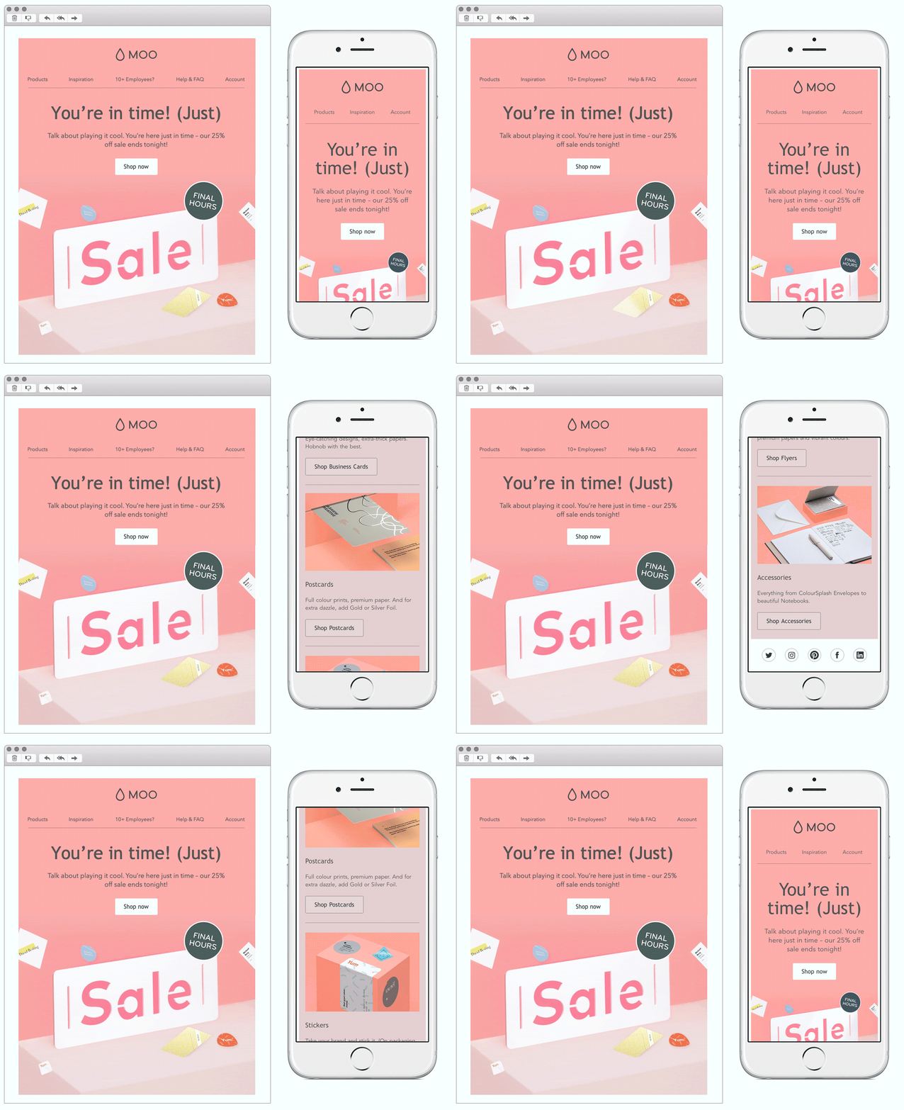
4. Moo
SL: Last chance to get 25% off absolutely everything
Chosen for:
- Consistency – Moo are always a welcomed brand in our inboxes, and they’ve proved exactly why with their communication this month. Their sleek mobile first approach makes their emails easy to navigate through, and the nice design with the use of GIF’s is very appealing to the eye making you want to keep scrolling down the email.
- Copy – Their hero headline is a fun way of creating urgency.
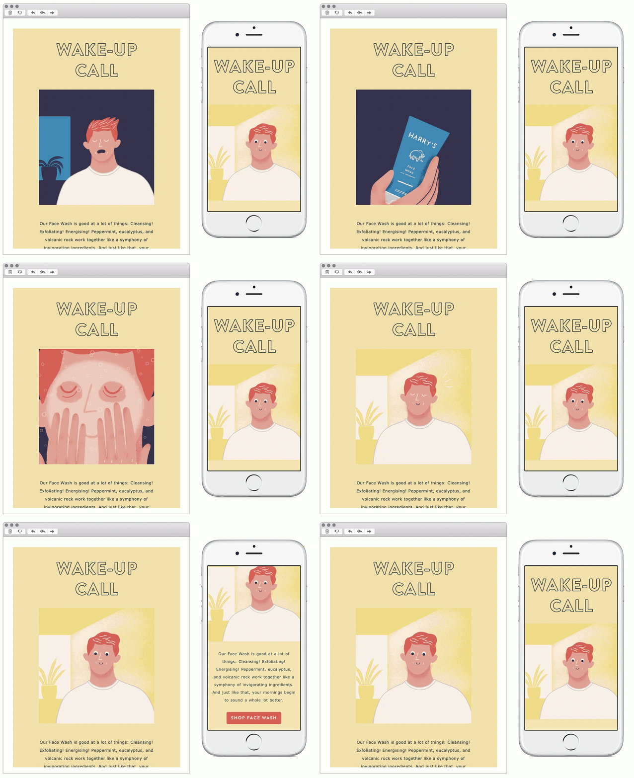
5. Harry’s
SL: Not a morning person? Hear us out.
Chosen for:
- Animation – Their hero uses animation to showcase the story of the product. This is a nice way to get a lot of information into the email without bombarding with copy.
- Whitespace – Good use of whitespace throughout the email. This keeps it clean and concise, allowing you to take in the content easily.
Any you’ve loved that we’ve missed? Let us know on Instagram or Twitter.


