Top Designs for November
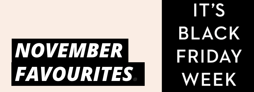
With inboxes going crazy this month filled with monochrome masterpieces a plenty, we thought we’d show a collection of our favourites that bucked the black and white trend. Enjoy….
1. ZARA Home
SL: Welcome to our home | Kids Collection
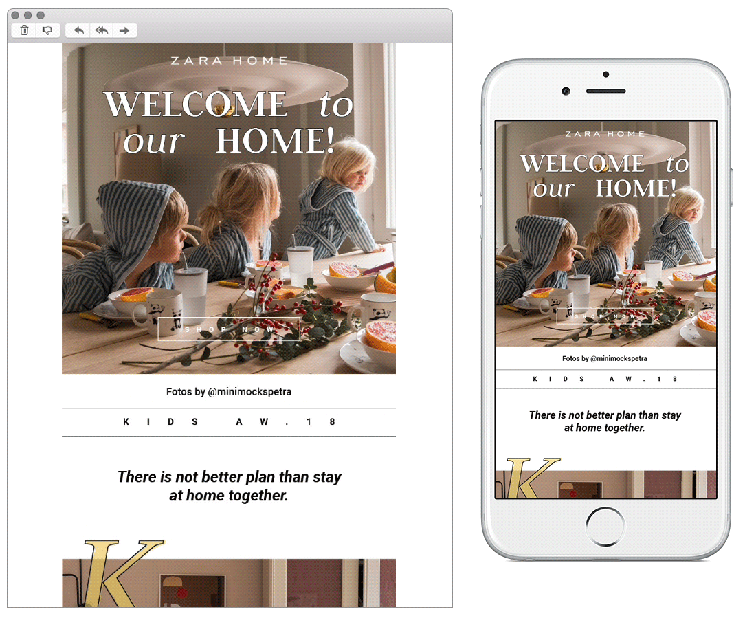
Chosen for:
- Layout. The simple method of left-to-right align can usually be relied on to create an editorial/cut and stick feel, or in this case, kids scrapbook.
- Font. Linking nicely with the layout, the use of block colour letters cascading vertically goes well to enhance the theme. The sans, italic font itself gives it a playful feel, too.
2. Boden
SL: 30% OFF: FRIDAY CAME EARLY
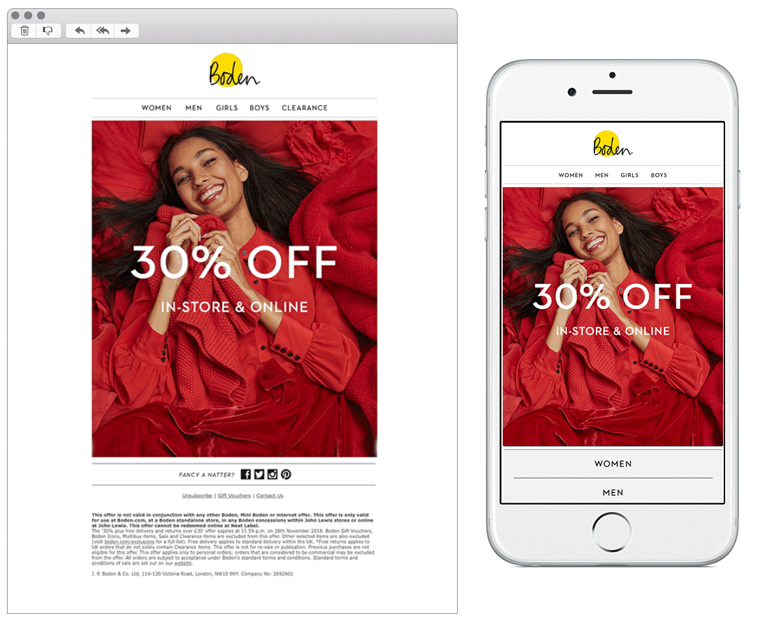
Chosen for:
- Animation. This colourful campaign hero really grabbed our attention, together with the flashing block colours, made it a refreshing find from all of the monochrome.
- On-brand messaging. Boden is always good at bringing personality to their messaging and they don’t disappoint here. The twist on colour to grab attention and the subtle copy like ‘Fancy a natter?’ gives them a bit of edge in the inbox.
3. Wilko
SL: We’re feeling merry – half price Christmas continues
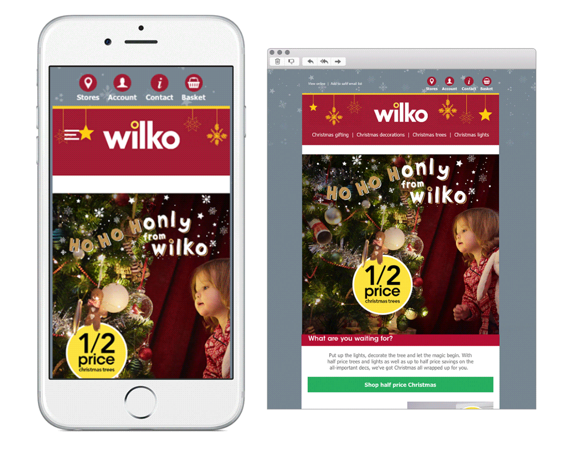
Chosen for:
- Carousel – tailored content on mobile including images. A great example of a carousel in this campaign from Wilko. Images change depending if it is viewed on desktop or mobile. These have been thought about too, for example, using a life size Santa to help you purchase the perfect size Christmas tree.
- Ratings. Nice use of product ratings to drive conversions. The overall design may not be as eye-catching as the others but there is some awesome thought behind strategy here.
4. Pizza Express
SL: It’s Snowball Dough Ball Day!
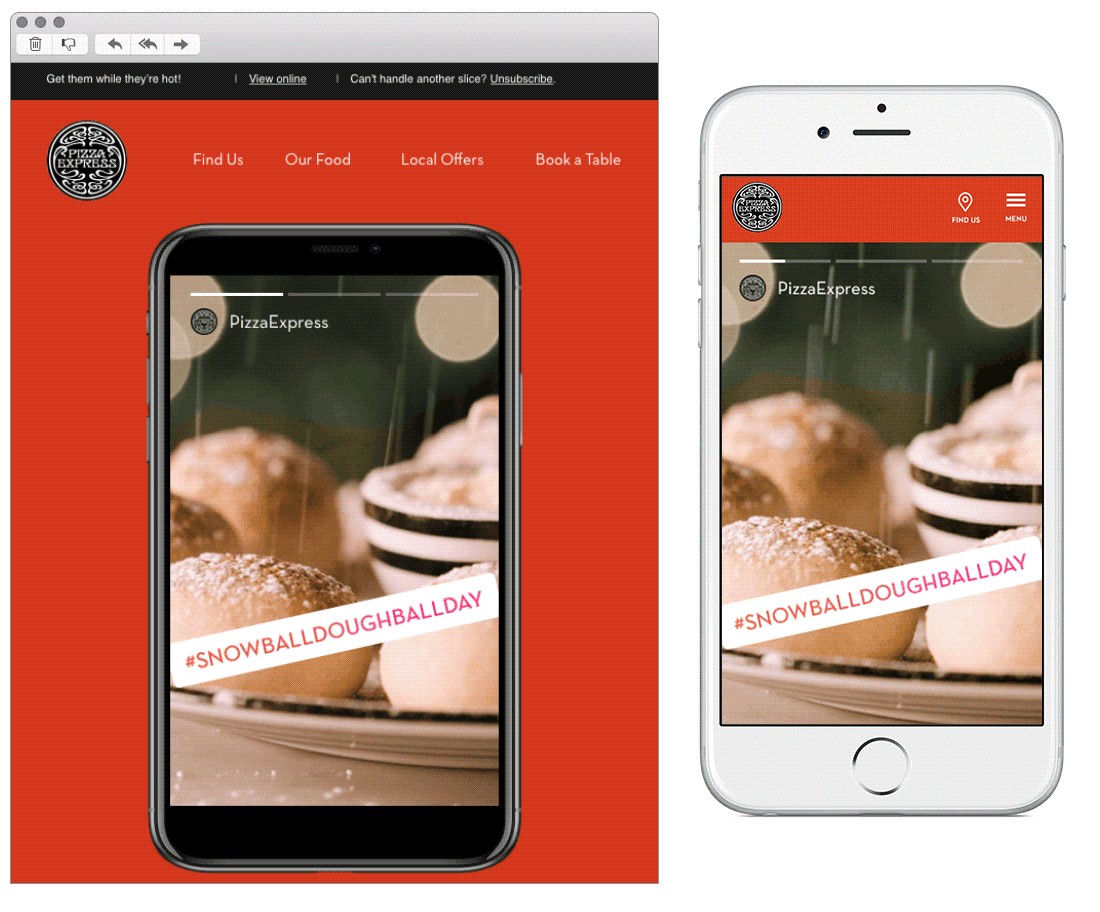
Chosen for:
- Concept. This campaign appears as if an Insta stories on mobile, sizing up to a red background on desktop. Each module is divided by colour with animation.
- Content. It continues on from their offer to show how it can benefit Macmillan which makes a nice change of subject amongst all the Black Friday deals.
5. Blurb
SL: Bookstore Flash Sale!
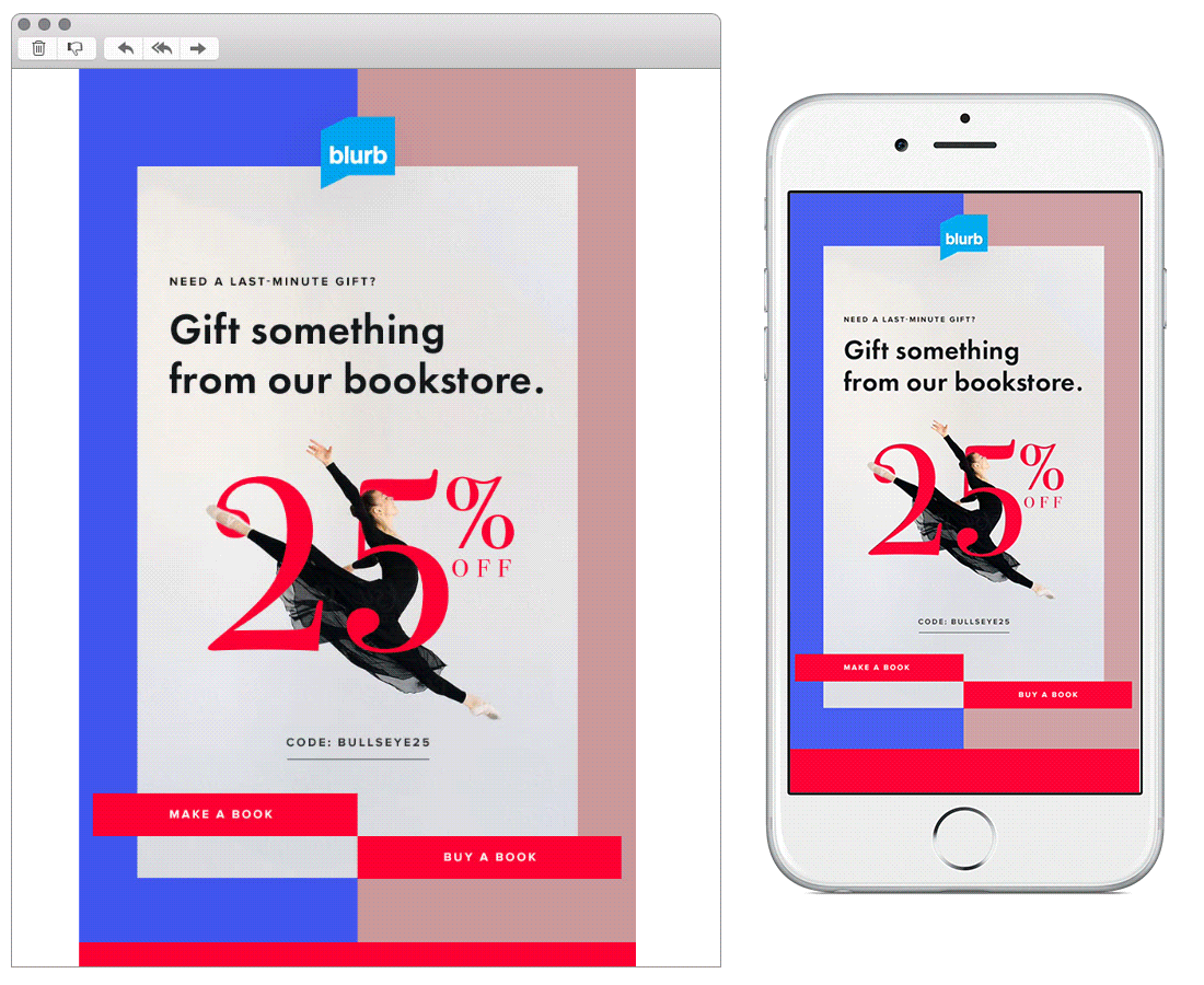
Chosen for:
- Design. A striking design from Blurb to promote their holiday offer. From the choice of colours to the blocking of shapes and CTA’s make this a stand-out email.
- Message. Blurb are known as a service to create your own books, steering subscribers into ordering last minute existing gifts is a nice twist (and will probably do them good in the big Christmas production rush!).
Any you’ve loved that we’ve missed? Let us know on Instagram or Twitter.