Top Designs For February
Yup it’s that time of year again! Our inbox’s were an abundance of hearts and flowers this month, but we wanted to mix things up for you and throw in some pancakes for good measure.
1. Not On The High Street
SL: Our most-loved Valentine’s picks

Chosen for:
- Email concept. Not on The High Street have themed this email around their staff members ‘top picks’. Although still Valentines themed this is a nice way to reinforce the human side of the brand.
- Categories. I know we’ve mentioned this before when we’ve highlighted NOTH’s emails, but the special edition of the categories in this email really caught my eye. Designed specifically to allow for easy Valentines navigation, this module ensures the users journey is as seamless as possible. Directing them to wherever they want to go quickly and easily.
2. Crabtree & Evelyn
SL: Not all routines are boring

Chosen for:
- Branding. Crabtree & Evelyn have really thought about the colour theme for this email, choosing a nice palette to reflect and highlight the individual modules and products. The design also ties in nicely with the brands online and social presence, reinforcing their branding and ensuring it’s front of mind to their consumers.
- Mobile first designs. This newsletter template has been designed to be fully responsive across all widely-used mobile devices. By using overlaid text on top of images they have ensured all messaging can be read clearly if images are not downloaded.
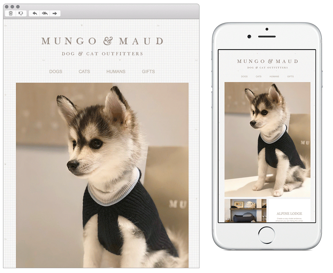
3. Mungo & Maud
SL: Wrap them up warm in chilly weather ❄️🐶☔
Chosen for:
- Content. Does this even need any explanation? I mean look at those photographs! Mungo & Maud use a lot of UGC content in their emails, enabling them to mix up the images used across their channels and interact with their customers.
- Social proof. Mungo & Maud have a huge following on Instagram and it’s nice for a brand to be proud of this and hero it within their emails like they’ve done here.
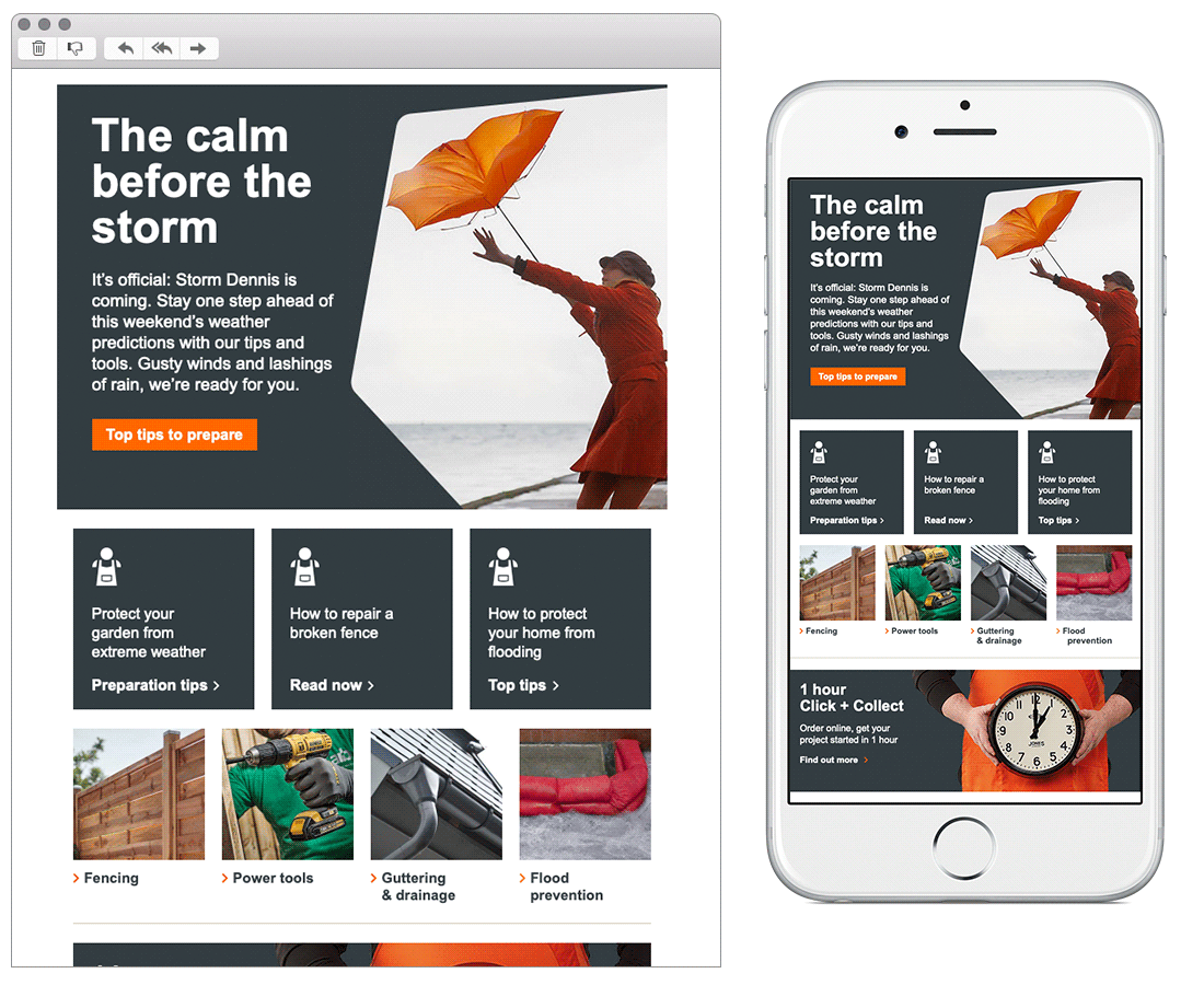
4. B&Q
SL: Storm-proof your home this weekend
Chosen for:
- Reactivity. This email was sent when we were faced with a stormy weekend here in the U.K. It’s great to see brands be reactive and hero the content which will be useful to its customers.
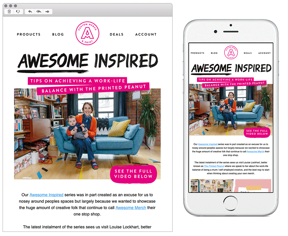
5. Awesome Merch
SL: NEW VIDEO! 🎥
Chosen for:
- Playful design. Awesome Merch have a very distinctive brand style, with the use of bold colours and collage style imagery which is also used across their website and social channels.
6. Sweaty Betty
SL: Find Betty: Open for a Valentine’s treat 💘

Chosen for:
- Engaging content. Sweaty Betty have ran this gamification style campaign before, using the hashtag #IAMSWEATYBETTY. This type of social proof helps to verify the quality of the brand, and inspire consumers to get involved in their community.
- Copy. They’ve used nice playful copy alongside the animation in this email. Keeping to the ‘treasure hunt’ style concept and using rhymes to keep the theme lighthearted.
6. Farmdrop
SL: It’s back and better than ever
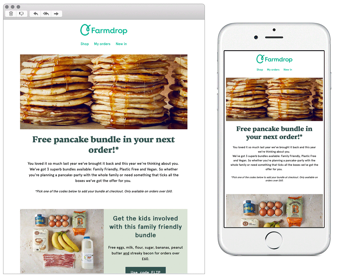
Chosen for:
- Content. Forget Valentine’s Day, Farmdrop have focused on the true most important day in February. Pancake Day! Using the occasion to showcase their relevant products, discount codes, and recipe ideas.
- Use of white space. Farmdrop have used white space well throughout this email. Breaking up the different modules, content, and copy. This makes it easy for the user to read and for your eyes to lead down the email.
Any you’ve loved that we’ve missed? Let us know on Instagram or Twitter.
Bex Highfield
Marketing Manager @ Action Rocket