TOP DESIGNS FOR OCTOBER
As the nights draw in this month and we all get used to 4pm darkness, we have our monthly email round-up to brighten your day!
We’ve tried to wade through the array of pumpkins and give you a well rounded insight into our inbox this October. Enjoy!
1. AO
SL: Open this. We dare you! 

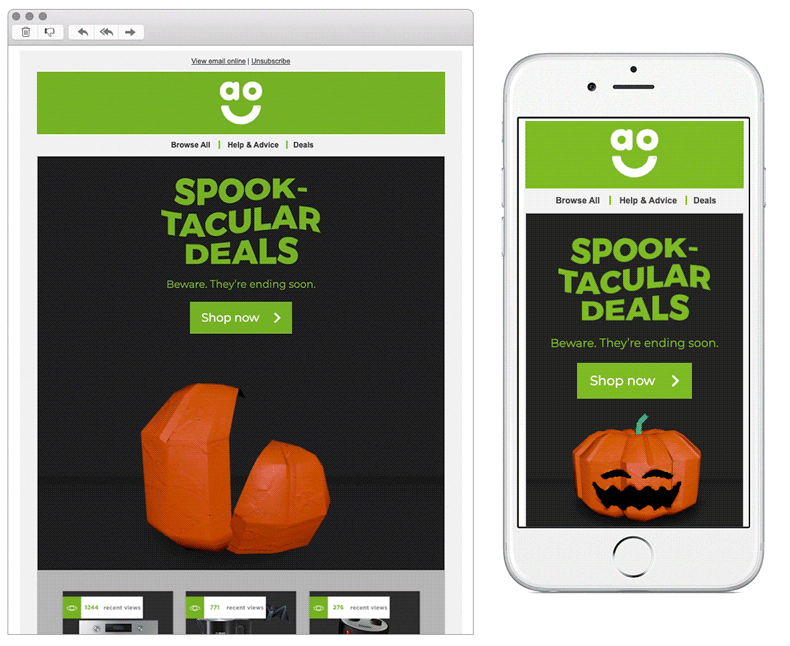
Chosen for:
- Animation. This colourful animation really grabbed our attention, and jumped out from the rest of the emails content.
- Topical content. Using tongue in cheek and Halloween themed copy, they have kept the theme throughout the whole email.
2. Roxy
SL: Keep A Breast x ROXY
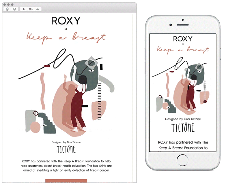
Chosen for:
- Animation. Another brand who have used their hero space within the email to highlight a well designed animation. The GIF itself was externally designed to raise awareness about breast health education, the same design has been printed on the brands products. This is a nice way for them to have joined together both digital and print.
- Mobile first design. The sleek approach to the design makes it easy for the recipient to navigate through. They’ve used a nice mixture of product imagery and copy throughout, without over crowding the email and keeping a nice editorial feel.
3. Not on The High Street
SL: Our most Insta-loved gifts
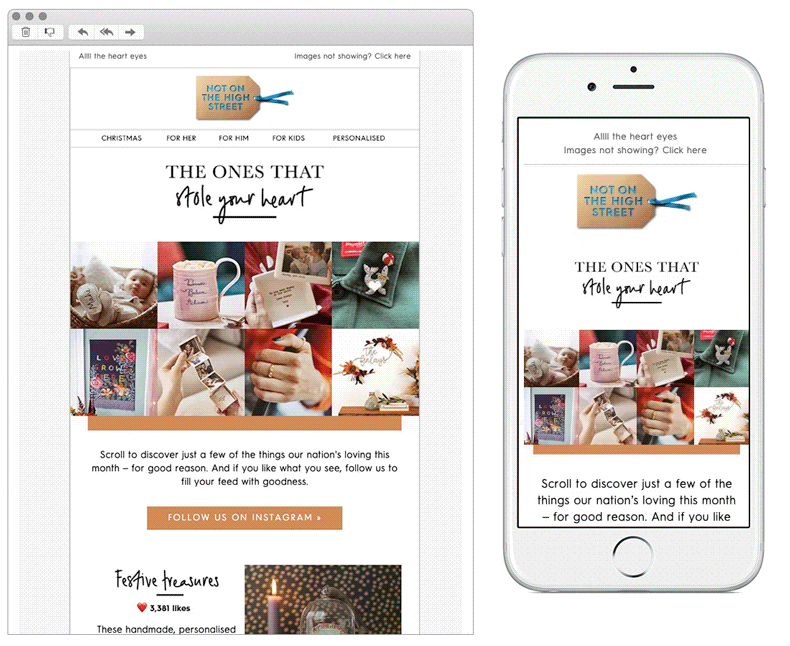
Chosen for:
- Linking all digital channels. Not on The High Street have done this well throughout both the design and copy in this email. By using phrases which recipients can relate to social channels like Instagram e.g. ‘like’ / ‘love’ / ‘heart eyes’.
- UGC. Pulling in images from Instagram and showing the amount of likes per image to display the popularity of their products works well.
- Subtle animation. GIFs don’t always have to be loud and in your face, this is a nice way of introducing action within email to add depth.
4. McDonald’s Australia
SL: It’s raining cheeseburgers
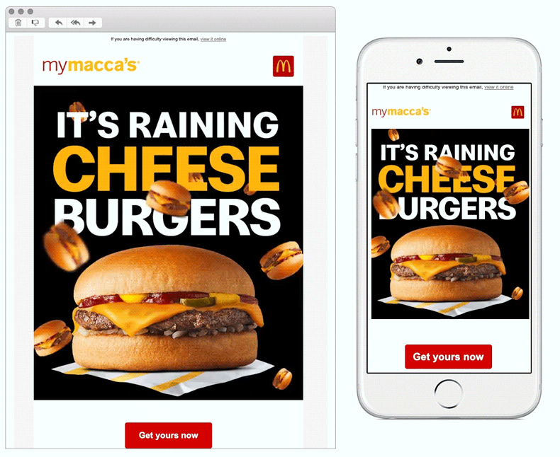
Chosen for:
- THE best hero. Come on have you ever seen a more eye-catching animation?
- Simplicity. McDonald’s have been straight to the point here with their messaging. With a simple mobile first approach there’s no chance the recipient will miss the message.
5. Litmus
SL: Are you afraid of the dark? 
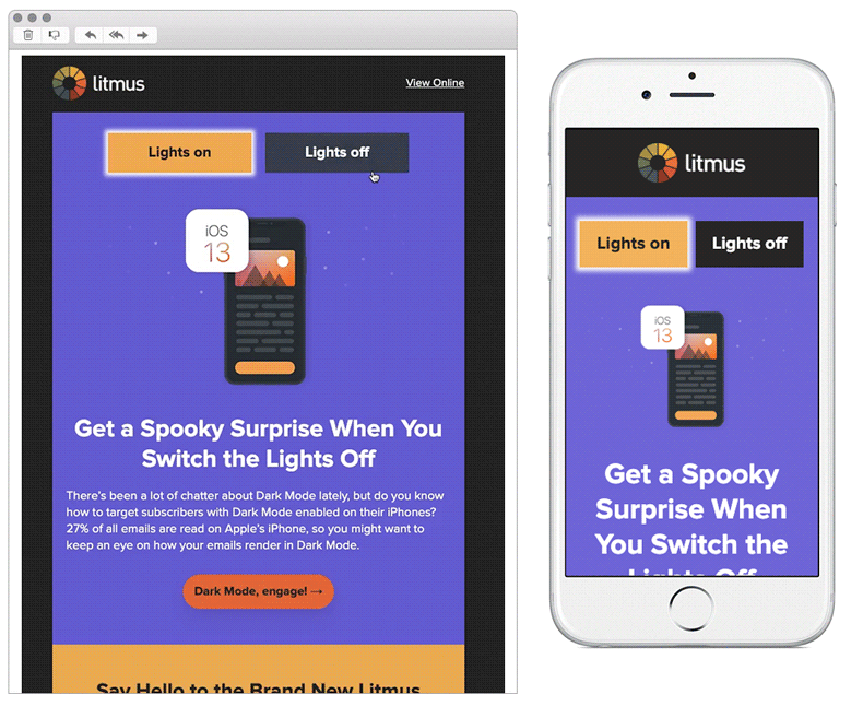
Chosen for:
- Nice design & coding. This email included a range of innovative techniques, showing off different capabilities within email and highlighted nice accessibility features.
- Topical content. Litmus tied together a round-up of great industry news throughout the email, allowing the content to flow seamlessly throughout the email.
Any you’ve loved that we’ve missed? Let us know on Instagram or Twitter.
Bex Highfield
Marketing Manager @ Action Rocket