The importance of QA in Email
aka why you should always check proofs in different email clients.
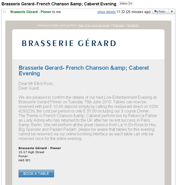
So first off, I don’t want to turn this blog into the new Photoshop Disasters, and also I’m not 100% sure if this is official or from some third party restaurant booking site. But regardless, here’s a good example of how simple mistakes can cheapen the look of an email and lead to users questioning it’s authenticity.
Issue number one is that entity codes seem to be appearing instead of the symbols they represent (particularly the ampersand). This can be tricky to catch, as different email clients can handle these differently, but it’s something to check for in the QA process. They can be problematic in the subject line, so maybe “and” is the best way forward there.
Issue two is that the greeting is included twice – once is custom published and one is generic. It might be a case that “Dear Guest” is the fallback, and for some reason it’s showing when it shouldn’t. Either way it reduces the impact.
Lastly, it’s not really a mistake, but the body copy is a bit chunky and hard to skim – breaking it out into two paragraphs and pulling out the key details in bold could make it easier to follow.
Kudos, though, for including the links to different language versions of the email in the pre-header.
On reflection..
This was probably sent out by the manager of the individual venue, and therefore this is probably more an exercise in empowering staff to use tools in the best way they can, and ensuring the tools are as intuitive and fail-safe as possible.
