Top designs for December

We finish the year with a round-up of our top emails from December, brining you a final array of brands who have jumped out in our inbox this month! We have some great use of data, content and animation for you to dig into!
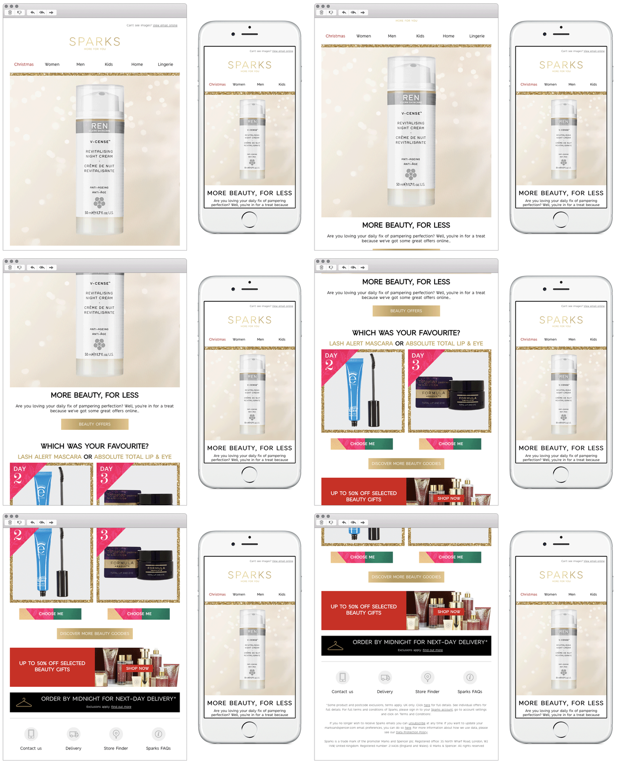
1. M&S
SL: Enjoying your beauty calendar? Discover offers up to 50% off online
Chosen for:
- Clever use of data. M&S were clever with this email, sending it to customers they knew had purchased a calendar in December, and basing the whole content around this. This enabled them to hero products they knew the customer had received and include rating modules. The only possible disadvantage to this email would be if the customer had actually purchased it on behalf of someone else… but we won’t let that rain on M&S’s personalised parade!
2. Fossil
SL: Save big on your Christmas Shopping
Chosen for:
- Strong design. Fossil use a nice clean mobile first design for their emails, making it simple for the reader to follow and navigate through.
- Personality. Fossil often use illustrations in their emails, showing an artistic side to the brand. This combined with the festive and complimentary colour theme, really shows off the fun side of the brand.
3. NEOM
SL: The Gifts (We’re Giving)…
Chosen for:
- Photography. NEOM have used great imagery throughout this email. Using a mix of lifestyle and product shots breaks the email up and gives it an editorial feel.
- Personal touches. The theme to this email is around what the team at NEOM themselves would choose for their Christmas gifts. This is a great way to showcase their personality and allow the reader to feel part of the ‘family’. NEOM could take this a step further and explore recipient personalisation, a simple name in the intro would be a nice touch.
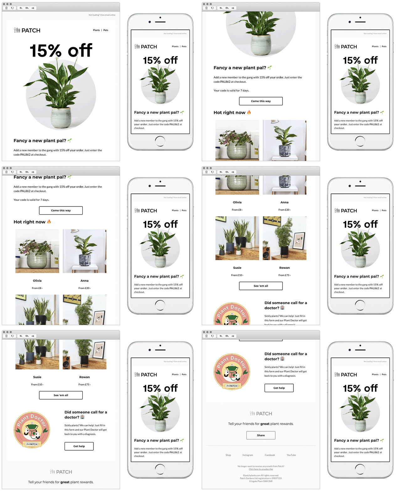
4. Patch Plants
SL: It’s agreed. There’s no such thing as too many plants 🌵🌵🌵
Chosen for:
- Simplicity. Patch have kept this email short and sweet. Leading with strong copy and an offer to draw the reader in, it’s nice to see them not include extra information for the sake of it. They always use great imagery, with a mix of product shots and ‘Instagram style’ UGC content.
5. Biscuiteers
SL: 10% off Christmas gift boxes!
Chosen for:
- Festive theme. The Biscuiteers have themed this email perfectly for the time of year, and everything ties up well around this. The brand always includes unique added touches to their emails, and the cute subtle animation in the hero is noticed here.
- Including their partners. Although this email is selling their branded gift boxes, they have a done a nice job to still shout about the partners they work with. Giving them a dedicated module to really discuss the items in full detail.
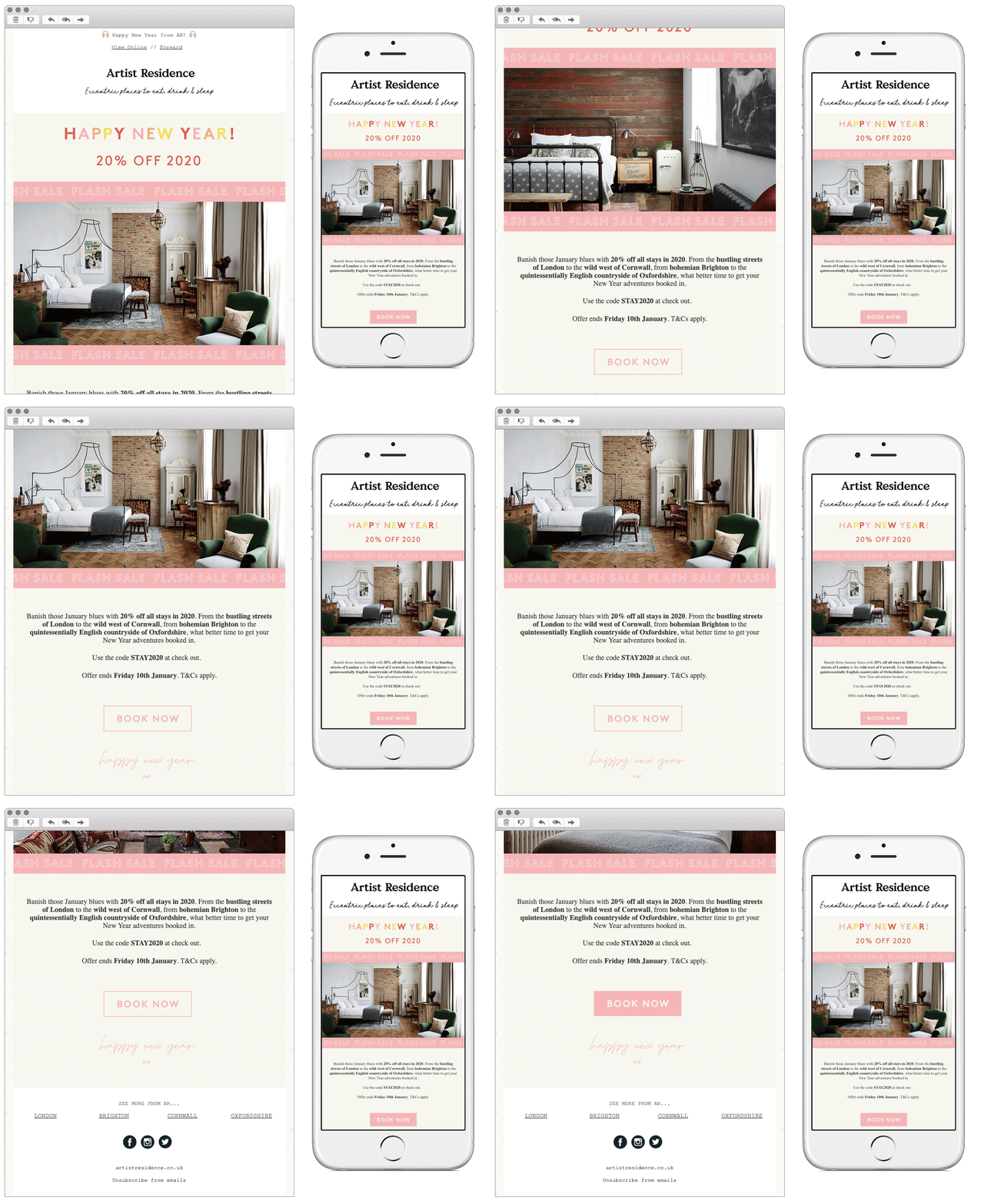
6. Artist Residence
SL: 🌟 20% off in 2020 🌟
Chosen for:
- Simple solus feel. The artist Residence have kept this email super simple with the nice solus feel to the content the reader isn’t bombarded with information. They have lead with their main offer and not let anything detract from that.
- Animation. Although keeping the email a short length, the brand have included a nice animation in the hero. Showcasing their available items in a great yet easy way.
- Typefaces. Using the combination of both typed and handwritten typefaces works well in this email, showcasing more of their personality.
Any you’ve loved that we’ve missed? Let us know on Instagram or Twitter.
Bex Highfield
Marketing Manager @ Action Rocket


